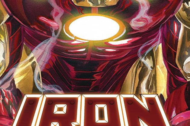
Iron Man #2 Review
Writer: Christopher Cantwell
Artist: CAFU
Colourist: Frank D'Armata
Letterer: Joe Caramagna
Armour Designer: Alex Ross
Publisher: Marvel Comics
The second issue of Iron Man starts by giving us a solid peek at the latest incarnation of Korvac, tooling up nicely for his role as the story's big bad.
Then we're plunged back into the humble, bone-breaking world of Tony Stark. He has a pair of rough fights, each of them leading to injuries and a sharp "what did we learn" debriefing session with the ever-sardonic Patsy Walker.
Now let me get straight to the critique: That aimless feeling I noted in the first issue is still with us. #2's fight scenes feel only loosely connected to the big-picture plot -- especially the first one.
But I urge you not to think of this as a weakness in Christopher Cantwell's scripting. It's in the debriefing scenes that the method to his madness becomes clear. These introductory scenes of Tony's new life are not united by plot but by theme. Patsy's incisive commentary interrogates Tony's motivations and feelings.
What emerges is a portrait of Tony as a guilty man, seeking self-destructive absolution for his past sins. He's aware of his hubris and wants to pay for it. But Patsy demands even deeper insight; she notes that despite the veneer of humility, his actions still betray considerable pride and privilege.
It's tough to be definite this early in a story, but I'm fairly confident that this portrayal of Tony Stark is going to connect to this volume's portrayal of Korvac in a magnificent "mirror image" way.
A major factor keeping this collection of scenes entertaining is that they're flawlessly illustrated by CAFU. His characters are extremely realistic, but he has no problem delivering the right expression for the dialogue. And let me spare a line to appreciate his smart background work. He doesn't fill up every panel with setting details, but he puts in exactly enough to make the world behind the characters feel as real as they are.
Frank D'Armata employs a distinctive colour palette. Rather than dialling up the intensity on the characters, he dials down the colours in the background. The effect still makes the characters pop out, and it works particularly well with all the detail in CAFU's art.
One colour nitpick, though: Crusher Creel (the antagonist in the first fight) is clearly drawn in his new Gamma Flight shirt. We couldn't get a splash of green to seal in the connection?
Turning back to Christopher Cantwell's script, I have to commend the craftsmanship put into the dialogue. Making the themes clear requires a certain amount of exposition, but it is smoothly massaged into speech that feels both natural and memorable.
In their second issue, the creators of this volume of Iron Man make it clear that they're hunting bigger game than a one-two-three plot. The selection of scenes may seem arbitrary -- until you step back and examine the huge themes that are building up. The thematic comparison between Iron Man and Korvac is already looking promising enough; the fact that the individual scenes are delightful makes this issue a rewarding read by itself.


Comments