Friendly Neighborhood Spider-Man #13 Review
Writer: Tom Taylor
Artists: Ken Lashley, Todd Nauck, Ig Guara & Dike Ruan
Colourist: Rachelle Rosenberg
Letterer: Travis Lanham
Publisher: Marvel Comics
Ladies and gentlemen, I was all set to write today about how I consistently prefer the "backup" Spider-Man title to The Amazing Spider-Man. In general, I find that creators craft much better spider-adventures when they're not slammed by the rigours of a biweekly publishing schedule.
And specifically, I love Tom Taylor's Friendly Neighborhood Spider-Man to pieces. I was really hoping that this issue would give me a chance to give it a ringing endorsement after I beat up on #2 a little too harshly.
But instead, I gotta chuck that narrative and tell you about the horrors of artist roulette.
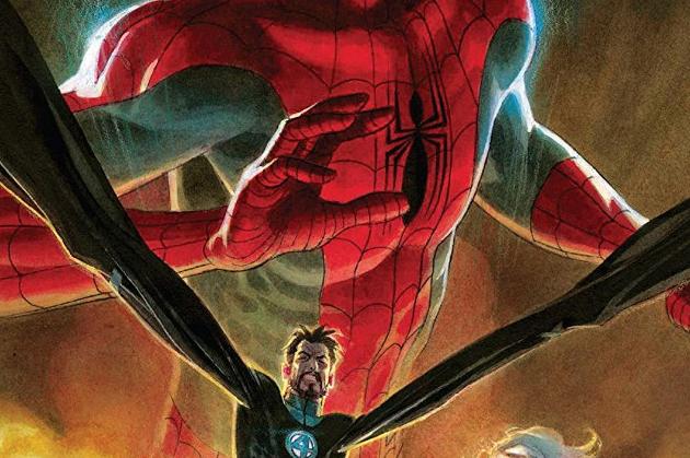
Friendly Neighborhood Spider-Man #13 is built on a fair script from Mr. Taylor. It's a nearly-self-contained adventure where Spidey heads back to Under York with his pals, the Fantastic Four, determined to bring an end to the assassination attempts the dictator Carrick has been lobbing his way.
There are street fights and super-science heroics and Sue Richards being awesome and a desperate last-minute twist and Johnny Storm getting tricked into engaging in what Ben Grimm assures him is deeply embarrassing nerd behaviour.
And all the good writing in the world can't save this comic, because it has a notably terrible case of artistic schizophrenia.
I have nothing against Ken Lashley, Todd Nauck, Ig Guara, or Dike Ruan. Give me a little time and I could pick out artistic tour-de-force comics that at least three of them should be proud of.
But FNSM #13 is not going onto any artist's wall of fame, and the way the different styles clash does mortal damage to the flow of the story. Rachelle Rosenberg works valiantly to tie it all together with a consistent palette, and her colours do serve as a unifying thread.
But it's not nearly enough to stitch together four art performances that struggle to connect to each other and feel mighty rushed even when judged by themselves.
I do love to play inside baseball with Marvel's creative decisions, but I have no idea what led to the choice to have this issue drawn round-robin style. Scheduling mix-up? Budget disaster? The dog ate the original pages?
I hesitate to judge too harshly. There's always the possibility that this was an emergency make-do effort to cover for somebody going through an illness or some other "more serious than comics" crisis.
All I can say is that the finished product is disappointing, and this is one case where rough art actively impedes the reader's enjoyment of the story. Tom Taylor's words are good, but not that good; this script needed the support of visuals that were at least consistent.
In FNSM #13, a decent script ties a bow on the volume's long-running Under York thread with a nice guest-star turn by the Fantastic Four. It's a good story, but not strong enough to withstand the confusion sewn by a rushed, disjointed game of artist roulette. This comic lacks the visual horsepower it needs to satisfy.


Comments