What If?: Thor #1 Review
Writer: Ethan Sacks
Artist: Michele Bandini
Colourist: Matt Milla
Letterer: Joe Sabino
Publisher: Marvel Comics
First off, let's be clear: Don't believe the title, the marketing, or even the introduction. It might say "Thor," but this is, both figuratively and literally, Loki's story.
And that's a very good thing. From the first green-tinged narrator's box, it's clear this story is in the capable hands of the trickster in one of his more heroic "God of Stories" moods.
The first scene delivers our point of departure with capable brevity: Long ago, brave Odin and mighty Laufey met in a titanic battle. What if the Asgardian fell? Asgard would be no more. Freyja would be imprisoned. And the heir to the throne would be snaffled into the harsh court of Jotunheim and the stern parentage of Laufey.
At its heart, this story holds true to the deep, complicated sibling relationship between Thor and Loki. A change of venue and father figure does surprisingly little to alter their chosen heir vs. unloved son dynamic.
The script makes full use of the Greek tragedy opportunities afforded by the premise. The clearest plot and theme inspirations come straight from the story of Oedipus.
Some readers might feel disappointed that being raised by Laufey doesn't do much to turn Thor villainous. I would strongly contend that the alternate path this comic chooses is the more fertile one. By painting all its characters in shades of grey, morally speaking, this story delivers far more depth than it could by making Thor a scenery-chewing baddy.
In fact, it might not even go far enough in mining empathy out of its versions of Laufey and Thor. They're painted as harsh but noble, fighting mainly for the security of their realm and their people. This is just a quick scrape off a very rich seam of ideas; there's enough thoughtful material here to fill a whole series exploring the conflicted cruelty of the frost giants.
On the visual front, too, this comic hints at the existence of greater depths. The art does a splendid job of moving the story along with clarity and vitality; that applies equally to the quiet moments and the action scenes. It's in the realm of design that more could have been done.
This comic draws heavy inspiration from Russel Dauterman's formidable recent Thor work. Giving Loki his trademark bendy horns in the form of scalp tattoos is the one bit of visual novelty, and it's highly welcome.
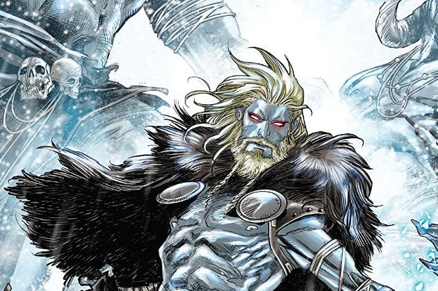
Charting the growth and change of Thor from Asgardian kiddo to God of Winter is a huge challenge. This book makes the journey work, and the character is always recognizably Thor, but little is done to really anchor the changes visually. God of Winter Thor is dressed 30 percent more raggedy than usual (10 percent if you look at him in his scraggly Odinson period) and he wields a hammer that's bigger, icier, and spikier than Mjolnir.
He also gets blue skin in the final act. While it's semi-sorta logical - Loki turned pink in Asgard, so why not? - there's just not enough space to give it a concrete explanation.
Blue is, of course, this issue's dominant colour. The rest of the colours are chosen with care in order to harmonize. In emphatic moments, greens and purples slide capably into play. Thor himself gets a nice balance between blue and warmer minor counterpoints provided by brown garb and blond hair. And the significance of Freyja's key scenes is emphasized by warming up the entire palette for them.
Thor's turn on the What If? wheel plays out quite impressively thanks to a thorough and thoughtful focus on his relationship with Loki. Clear, strong art and a script willing to park all its characters in between heroism and villainy create a fascinating world. This first glimpse is thoroughly satisfying, and more than many hypotheticals, this one cries out for further investigation.


Comments