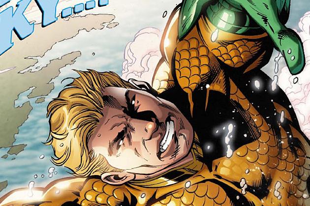
Aquaman #26
Writer Jeff Parker Artist Paul Pelletier and Netho Diaz
Introduction
Aquaman had a truly beautiful happily ever after when Geoff Johns left the series in issue #25. In superhero comics nothing really ends, even for someone like Aquaman who likely needs a break after all that he has been through. The Johns’ run took place over the span of more than two dozen issues, superhero comic books are rarely ever allowed to go under the pen of one writer with a singular vision, especially DC Comics. Johns seems like he is attempting to take really good care of the hero going forward, and passed of the reigns of the undersea adventurer towards Jeff Parker. The writer has had somewhat of a fragmented career, but steadily working in comics since the mid-90’s. Hopefully, he can keep working on this book diligently and really starts to get some new eyes on the deep-sea adventures of Aquaman and company. Johns left the character on some good terms, and it will be interesting to see how Parker handles the this world.
Writing
Jeff Parker takes Aquaman in some new directions with this first installment of his run. He also writes Aquaman and Mera with a slightly different voice than was previously developed. The mysterious Triton is also set up as an interesting new facet into the character. The cover advertises the king of the sea in the air, which is an action sequence that was very entertaining to observe. While this tale taken as an individual piece of a larger story was an okay issue, readers will have to give the new scribe more time to develop what he is going to contribute to the book. Certain plot threads, like Arthur accepting the throne with Mera now full time, shows patient fans that this book is indeed involving, even without someone dying or tragic upsetting things happening to them. The subplot with the reporter could lead somewhere interesting, and the cliffhanger houses another opportunity for Parker to add something new to his era of the comic.
Art
It seems that new artist Netho Diaz handles the first eleven or so pages of the title. His art is slightly more loose than Pelletier’s. Diaz seems to be refining his illustrations in this issue, as they can be looser than the average DC house style. The mythical creatures and background details are drawn quite well by the penciller, but his people look stiff and harsh, in ways that do not complement the book. DC has also awkwardly split up the pages between the two artists, as they roughly go back and forth in the issue. In issue #25 it seemed like a light went on in the head of Pelletier, his artist looks so polished and refined. Each page drawn by the artist is simply lovely. The different aquatic creatures that he draws are still quite menacing, but Aquaman and his supporting cast are now leaping off of the page. If Diaz can polish his style the same way that Pelletier has over the past few installments of the series, this could be one of the most beautiful comics on the stands.
Conclusion
Aquaman seems like it is in a good place, as Parker starts to establish the different elements he is going to add to Arthur Curry’s world. The art by Pelletier in this tale shows how much better the artist is getting with each issue.


Comments
The main purpose is known to be the ravine.It may also involve in the following topqualityassignment review services process and make the thing under control by the passing of time and generate the revenue.