Marvel Knights Spider-Man #2
Writing Matt Kindt Art Marco Rudy
Introduction
Marvel Knights Spider-Man #2 was way better than it had any right to be. The series featured a younger Peter Parker about to embark on a gauntlet of super villains. 99 different Spidey baddies are set to face him over the duration of the mini-series. Swamp Thing artist Marco Rudy has made this book a creative love letter to the franchise. Readers get to watch him pour his heart out over every single page of this wonderful new book. The artist threw so much incredible detail into the first issue, that readers were ushered deep inside a whole new world. The different approach to Marvel Knights with letting creators go completely insane, is going to usher in great results like this going forward. Matt Kindt is in charge of the psychedelic scripting for the title that requires a fine balancing act. Much of this book involves letting the spectacle speak for itself. He has to give the title context, but not drown the pages out in dialogue. The first issue contained a wonderful approach to the scripting.
Writing
The first page offers readers some context into the story in a succinct manner, then Kindt and Rudy hit the gas and begin the story. Wild ideas spark immediately, like interpreting Peter Parker’s spider sense in a modern style. This book has a rhythm unlike anything else in modern comics, the easiest thing to compare the reading style to is a Neil Gaiman novel. There are so many wild ideas here, that readers are going to get swept away into the mystical properties. Staring at the page equates a the sense being overwhelmed in a similar manner to Sandman Overture #1. That issue may have slightly more story, but the fairytale like qualities are effervescent in this saga. Writing by Kindt takes the classic Spider-Man dialogue and places it in this bizarre context, adding weight to many of the silly one-liners used here. Watching a Spidey just as confused as we are, makes the tale grounded enough to follow.
Art
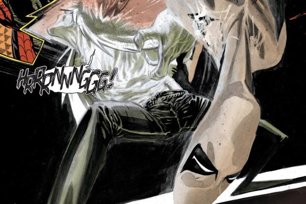
This may be a quick read for some, but reading a second time adds some nuance. It is absolutely enthralling to see Rudy blend three different times of art styles in the book. The surreal whites, greys, and blacks is one variation. This style makes the surreal seem possible. The second version of his pecils has the more standard approach. Draftsmanship is slightly exaggerated here with long necks and curvy lines. It is still a very enjoyable twist on his main pencil style. The last version has the same qualities as the covers. Where Rudy eases up and lets a sillier tone infect the page. The cartoonish figures convey a sense of irony that makes them look so devilishly sinister. Mixing these three different sides of one artist together makes this book an engaging resume for the stylistic chameleon known as Marco Rudy.
Conclusion
With the writer sitting back and letting his artist breath, Marvel Knights Spider-Man is wildly innovative. There is no risk that this comic book will not take in adapting 99 villains into one short story. Fans of the medium should indefinitely have on eye on this series.


