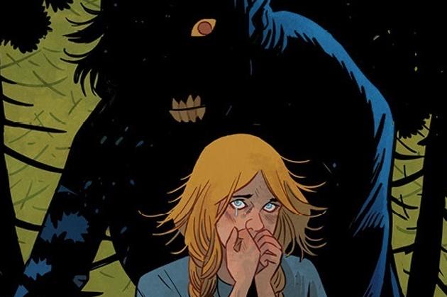
Folklords #3 Review
Written by: Matt Kindt
Art by: Matt Smith
Colors by: Chris O'Halloran
Lettered by: Jim Campbell
Published by: BOOM! Studios
Ansel has snuck past the all-seeing Librarians and entered the woods to begin his journey for the Folklords of legend. However, his quest has been put on hold after crossing paths with the dreaded Weeping Wood Killer.
The sudden and surprising change in tone from the last issue crosses over into this one. The horror that has been instilled continues and gets even tenser as this issue’s events unfold. This was a suspenseful issue that played with the unpredictable nature the narrative has taken. Watching Ansel be put through this situation was like pulling teeth (or drilling them). For a moment, it entered my mind that they were really about to pull the trigger on a huge character death. Early on in the issue a twist left open from the previous issue is wrapped up and makes the dynamic of what is happening to Ansel all the more interesting. We get a (sort of familiar) backstory to some characters that adds to the lore of the characters, and also the world. It seems that more concrete information about the Folklords is surfacing. We get a glimpse of something maybe not “of this world” and closer to the world Ansel has visions of.
There is still time taken in this issue to display some of Ansel’s character traits. He has a talk with someone where his optimistic world view is shown, and it is a shining example of what he and his quest is representing. His “outsider” view of living in a world that’s forcing you to be something you feel you aren’t is the sort of drive that makes a reader want to see him achieve his goal. That was an excellent move by Matt Kindt to reiterate his motivations in that scene. Another good part about that scene is that it wouldn’t be happening if Ansel hadn’t specifically shown his optimistic side in an earlier issue, so it really feels earned. In that scene, we are also given the details of the next chapter of Ansel’s journey, and a new person who will accompany him. After the oddities from the last issue that made Archer a wild card, even bigger questions about him arise. And, the end cliffhanger introduces another character that is on track to become more entwined in Ansel’s quest. Framing the issue, as in the previous ones, is a narration. They have all been bizarre with seemingly impenetrable meanings that help the unorthodox nature of the narrative. But, in this issue, it has some of its most puzzling additions to the story but does help to cap the story off nicely. This story has been a yellow-brick road that you’ve been told to follow but haven’t been told where it leads. It’s the preverbal rabbit hole, and while the fall is quite nice, it seems everything is going to be decided by the landing.
The art, like the writing, keeps its sinister atmosphere from the previous issue. It is putting the “grim” into this fairy tale. The opening page is an absolutely great layout. On the left are, slightly childish, images of violent torture, juxtaposed with tools, on the right, ready for said violent torture. Its re-sparks the tension of the previous issue and crawls to the shot of Ansel strung-up and helpless. Matt Smith uses shadows nicely to give an unnerving horror to these shots and the palette by Chris O’Halloran does just as well to capture the mood. The twilight purples, dark blues, and greys used throughout keep the aura haunting. The character talking to Ansel is drawn in the “bubbly” style from Smith, that I love, and that adds to the façade this character has used to lure Ansel to this place. Similarly, we are given a flashback involving children, but Smith’s shadows and the palette instill the spirit of its sinister nature. Then, we’re shown that Smith is as good at drawing pretty faces as he is at grotesque ones. And while the villain’s face is grotesque, it was the last couple panels of the flashback that had me whining; something about the corrupt and innocent styles merging in that one moment made it worse. Throughout the issue, the panel layouts were subtly neat and made for a nice read. I think the art and especially the coloring has been one of the key factors in easing the stories in and out of its multiple tones. In this issue, when it is “scary” that twilight palette really helps and when it’s “safe” a warmer/cozier feeling is instilled. Then, in a shot of a horse galloping, Smith uses fewer shadows and the palette is lighter giving it an adventurous mood until the last shot when the foreboding nature is brought back to imply the dangers that lay ahead.
As unpredictable as the structure is, it manages to stay entertaining throughout. The suspense is kept up in this issue and a sense of action and adventure is there too. Ansel’s determination is driving him and the story. The questions are getting bigger and the answers seem to be getting closer. But, this series has subverted my expectations before, will it do it again?


