Ice Cream Man #12 Review
Writer: W. Maxwell Prince
Artist: Martin Morazzo
Colorist: Chris O’Halloran
Letterer: Good Old Neon
Publisher: Image Comics
Ice Cream Man #12 surprised me. I love this series and know each issue is going to be good, but when I started this twelve issue and I saw a man in space with something called bOb who very much resembles HAL from 2001: A Space Odyssey, I was afraid that it would be a loose retelling of the story from the movie. But as soon as the issue kept going, I found myself surprised that bOb was simply a tribute to a science fiction classic and that W. Maxwell Prince had something very unique in store for me. Really, I'm ashamed that I even doubted him.
The writing in this issue displays one of the things that I find most impressive about Prince’s talent. He is able to write entire issues that completely grasp a different theme or subgenre and is able to do it so well. We can call Ice Cream Man a horror series, but it shape shifts into so many other things and it keeps the series so fresh and exciting. Actually, this approach is similar to how we see the Ice Cream Man himself in all of these issues. He is always the Ice Cream Man, but he morphs into different kinds of people in whatever kind of story the issue is telling. This twelve issue is a perfect example of everything that I mentioned above. It is a dark science fiction story that both follows a similar formula that we’ve seen in Ice Cream Man issues as well as being different enough to be interesting.
This eerie story is told using the main character’s thought logs which helps creates a sense of suspense. Prince also uses these logs to slowly unveil how depressing and ominous this man's entire situation really is.
I praise Martin Morazzo’s artwork in reviews every month but I won’t stop because he deserves the credit. W. Maxwell Prince has created an amazing story and executes it brilliantly every month and Morazzo’s artwork is what enhances the storytelling to such a frightening degree. This series may be pretty scary on its own, but Morazzo’s illustrations are what make every issue seem so unsettling and sinister.
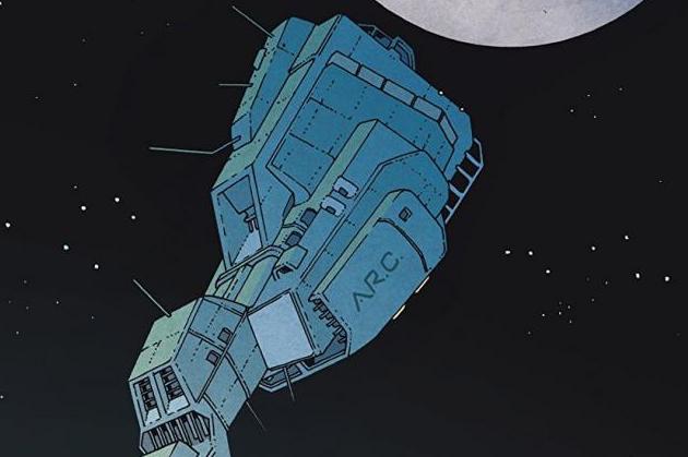
Above, I wrote about how the story shape shifts every month to something different because Prince has the ability to do that. Well, just as impressively, if not more so, Morazzo creates these different settings and situations every month with such ease. His artwork also morphs into something different with every issue and it is mind-blowing that he is able to do and still always make is completely convincing. We see that in this twelve issue with Morazzo's visuals of a lone man deep in space. His visuals display the vastness and the lonliness that this man in space is experiencing while also providing us with plenty of excitment.
Ice Cream Man #12 is everything I want from the series. Both the writing and the artwork come together to create a shocking and menacing issue that beautifully keeps the momentum of the series moving along quickly.


