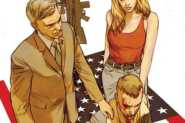
American Carnage #3 Review
Written by Bryan Hill
Art by Leandro Fernandez
Colouring by Dean White
Lettering by Pat Brosseau
This is such a wonderful book. Not from a content perspective, obviously. This book is dark and serious and extremely fascinating to see unfold. The craft is stupendous. This is the best thing Bryan Hill has ever done so far in his career, and the Leandro Fernandez and Dean White artistic collaboration elevates both of their work to a new level for me.
This issue did a lot of works in terms of building up the characters and the organisation that our main character is investigating. The relationship between Richard and Jennifer in particular is something that slowly bur surely seems to be growing into something a bit more than a basic employer-employee one, mostly because they have some sort of tragic event that will bind them together. Jennifer's utmost priority is her daughter and Fernandez's beautiful panelling of a scene involving the two of them is so subtle and so well-done, and gives me reason enough to believe her love for her daughter.
You got the sense that Richard was in over his head in the previous two issues, but here things get bloody and freaky and weird, and the severity of the organisation and just how deep it goes comes into focus here. Richard's psychology is the theme of the issue as his bloody encounter at the beginning of it harkens back to the incident that made him quit the FBI.
The Fernandez/White pairing is my favourite aspect of this book. I'm a huge fan of Dean White in particular but I can normally detect when he's involved in a book but here his art is more vibrant and generally more colourful. It helps with the dramatic nature of the book, in that White goes for more stark colours to emphasise impact or drama. This honestly might be the work of his career as I've followed it. Fernandez is also an artist I massively respect. He uses the nine-panel grid often here and he uses it well. The grid is a trap for a lot of artists since some use it as an excuse to simply repeat panels, but the beats that he and Hill build in these pages just work.
There was an entirely random page in this issue that I simply didn't understand. It was page 15, and contains three scenes that, at least at this point in time, seem entirely unrelated to the story at hand. It's perfectly fine for them to come into play later on in the series, but it needs to be made clear that they're important. I was incredibly confused when I came across it and I thought I misread the whole issue.
This book is just stunning and gorgeous. There was some confusion over a strangely-placed page, but otherwise the writing is strong and the art is even stronger. This is definitely the best Vertigo book you can pick up.


