THE BEEF #4 REVIEW
Plot/Script/Letters: Richard Starkings
Plot/Script: Tyler Shainline
Art & Colors: Shaky Kane
Design: John Roshell
Publisher: Image
I think The Beef #4 started out really cool. At least, cool looking. The characters were in an old school paper doll cut out style, complete with the outline to cut and lines to fold to make them stand up. And it started out using that to remind the readers of the story and characters so far, but then it kept going.
Had a cow talk the horrors of the milk industry. And. I am very careful when I review this series because I want to be critical of the comic and not the message of it. This comic was short on story because over the first third of the comic was just vilifying the dairy industry. I will admit, milk did have a big part of the (abbreviated) plot, but it’s really a stretch to say the anti-dairy intro had anything to do with the comic.
The actual story pretty much seemed to be just the climax of the five-part arch (although surely they are holding some of it back for the final issue next month). That part was fairly quick and exciting, but I have a feeling readers might be tired before they get to that point.
Also, the last page, seriously is a jaw dropper. Just read it and see.
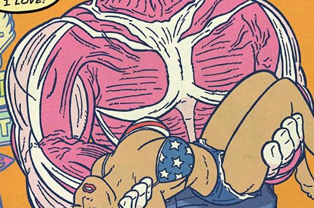
The art was fun. In addition to the interesting intro, fans of silver age comics will continue to love it.
In short (as if this review wasn’t short enough already) The Beef #4 was long on preaching, short on story, and had a surprise ending completely out of left field. Enjoy.


