THE BEEF #3 REVIEW
Plot/Script/Letters: Richard Starkings
Plot/Script: Tyler Shainline
Art & Colors: Shaky Kane
Design: John Roshell
Publisher: Image
I’m surprised. I don’t know if The Beef is getting better, or if it is just growing on me, but I kind of enjoyed this issue.
I think the best thing it had going for it was the simplistic story line. It mainly followed Chuck, a.k.a. the Beef, the whole time. The only time it strayed for a page or two was to cover Mary Lynn and her family, and the events that transpired came back to have a direct impact later in the issue. In my reviews of earlier issues, I kept harping on the fact that I didn’t know what was going on, and I think that was because there were so many characters being thrown in with scenes on their own away from Chuck, and there just hadn’t been enough information presented to keep everything straight. That was not a problem this time. I felt like I knew what was going on the whole time.
The attempts at humor, still mainly beef puns, were tolerable, but I didn’t see any genuine comedic moments. And, it’s becoming clear that Chuck, in his transformation, is also going from a slaughterhouse worker to a vegan, so that really clears up this book’s intentions. But, the problem is there are two ways to go about doing this kind of thing: have an agenda, then try to build a story around it, or have a great story that promotes the agenda. The Beef does the first, and that really never works well.
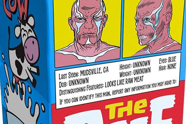
And I know I have been back and forth on the artwork in this series, but in this issue I was really digging it. Growing up, all I had were stacks of silver age comic books, so the art in those books is what I thought comic book art had to look like. It’s what I practiced hours and hours to try to emulate. So, seeing a book done in that style and done well like it is here is nice.
After reading the first couple of issues of The Beef, I predicted it would be a series that will pay off if you have the patience to stick with it, and perhaps it is nearing that point.


