THE BEEF #2 REVIEW
Plot/Script/Letters: Richard Starkings
Plot/Script: Tyler Shainline
Art & Colors: Shaky Kane
Design: John Roshell
Publisher: Image
If you didn’t know what was going on in The Beef #1, get ready, because #2 doesn’t get any clearer.
Remember Inside-Out Boy, the kid who flipped over the swing set and suddenly had his insides on the outside on 90s Nickelodeon? Well, Chuck, a.k.a. the Beef, starts the comic looking something like that. He does demonstrate his strength in the initial pages, but then returned to his normal form, and that’s about all we see of him.
We then follow Mary Lynn (probable love interest) and we see her story of struggle as a Mexican immigrant. Except, all of the dialogue involving her and her family is in Spanish. Maybe it is easy enough that anyone who took high school Spanish can understand it, but for some reason my genius self thought I would be better off with three years of Latin and four years of ancient Greek (by the way, it wasn’t), and I couldn’t decipher 90% of the Spanish dialogue.
We also hear of Vodino (the money-grabbing, greedy businessman)’s escape and immigration from Smyrna. Pick up a pattern yet? Combine that with the not so subtle anti-meat industry message, this comic does tend to get a bit preachy, and that distracts from the book. I am all about comics tackling social issues, whether I agree with their side on the issue or not, because it is using the platform for a greater good, but, The Beef does it rather poorly.
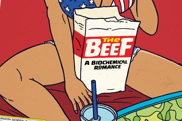
Flipping through, I initially dug the Silver-Age inspired art. Nostalgia factor and all. But, as I read further, it just didn’t hold up. The characters seem stiff. Movements are unnatural, and half the time the characters look like stickers just slapped onto the pages, unable to interact with the environment.
The Beef #2 just comes across as having more filler than a school cafeteria meatloaf, and it isn’t nearly as satisfying. But, dangit, its covers are so good, I just keep coming back.


