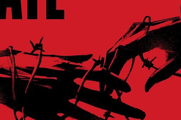
Days of Hate #1
Writer: Ales Kot
Artist: Danijel Zezelj
Publisher: Image Comics
I’m not entirely sure what message this first issue of Days of Hate is trying to tell us, but it definitely has me a little confused. The comic almost immediately opens up to investigating modern day Nazis and their crimes of killing queer people. And then there’s a quick shift to a woman with a trained bird who is picked up by some authoritative group. The issue continues to confusingly shift this way between two women’s lives. We discover their connection towards the middle, which does add some context to what you read up until that point.
I don’t know if I am just exhausted by politics in America or burned out on reading and watching stories of hate groups having control, but I just don’t know if I want to read a comic book that is just this exact scenario. It takes place a few years in the future from the current year and it appears that dissention between the alt-right and everybody else has grown even more. We’re even given a meeting of alt-righters with one of their small children running around with two guns. I hate the alt-right with a passion, but reading a slightly unoriginal (so far at least) story of a hate group versus the other side is what I’m reading in reality every day. I don’t think that our media shouldn’t portray reality, because I think it can and absolutely should. But I think it should be interesting and engaging so that it’s entertaining and not just another dark boring comic book about modern day Nazis.
Now that can all change as the series continues of course. We realize that we are going to watch a battle between ex-lovers, one who has been radicalized to the Nazi movement and one who hasn’t. We cannot actually be sure the radicalized one is in fact a Nazi, as she does destroy a lot of them in this issue. It could definitely unfold into an interesting battle between the two, but this issue wasn’t solid enough to make me long for the next one.
The artwork is interesting as well because there are times when I didn’t like it, for example, the way a lot of faces were drawn. But then there are times I thought it was beautiful, for example, in the two page spread of the dark aerial view of the city and the explosion.
This first issue has some things well-done, but doesn’t give us a lot to be entertained by. I will read the next issue and see where they decide to go with the story, but I’m not anticipating it.


