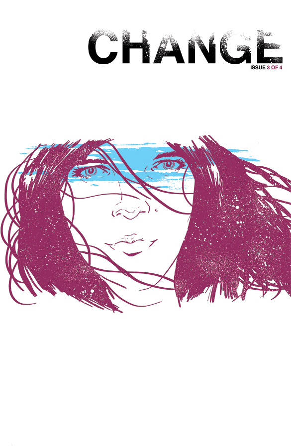
Change #3
Change continually manages to impress with every issue, pushing the creative boundaries in comics with its prose, art, and colours. Never has a title been so apt at what this entire series manages to do to a reader.
Writer: Ales Kot | Artists: Morgan Jeske & Sloane Leong
Cover: Jordie Bellaire | Publisher: Image
For those that have been reading Change up to this issue and have a total grasp of everything that’s been put onto the pages, congratulations. Also, you’re full of it. While it’s true that with the release of each issue, this third one being no exception, that the pieces of everything come together more, but it’s doubtful that a full reveal on everything is going to exist.
Change is like reading extremely captivating poetry. Among all the dialogue, the remainder of the text is prose, prose that challenges your thoughts, how you think you feel, and your perception on life, and perhaps how philosophical of a reader you are, the bigger picture on our existence and purpose on this planet.
Los Angeles is dying and there’s no way to stop it.
The third issue of Change delves more into their cast of characters as they quest to save their city (world, even) and while I admit to still occasionally being lost when reading, there are definitely a few more pieces that I’ve managed to sew together. As we look at more of who these people are, and their relationship not only to each other but people that have forever shaped their lives, so much of it determines their motivations, and at certain points there are lingering moments of hope for each of the lead characters, but given the basis of Change as seen in three issues, nothing is certain. There may be no hope, no chances, and it’s all just a show of how death brings everyone to a change, in how they live, in their personality.
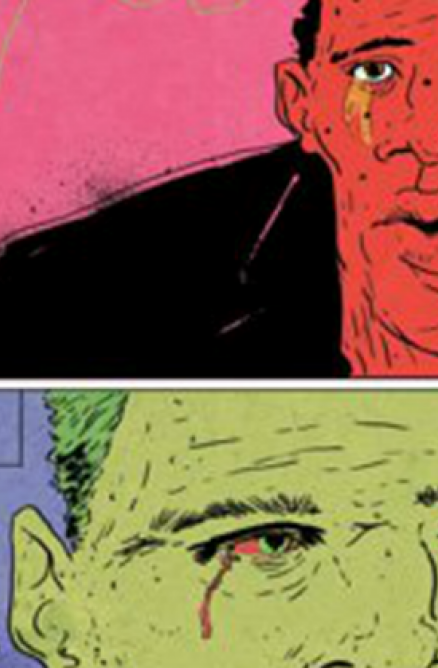
One of the greatest aspects about Change though is that it’s all left up to reader interpretation, as witnessed by the art which is ever-changing each panel. A personal favourite is when W-2 enters a more ethereal plane—the colours are to die for and if I weren’t already sold on the colouring, this would have been the selling factor. For most of the pages, the colours are vibrant and bold, and while that still applies to these few pages, the colours also manage to be soft, to exude the fantasy elements of precisely what W-2 happens to be doing and whom he is communicating with. Each panel offers a different perspective and when corresponding with the text, takes on different meaning.
Change is truly a work of art, and even by the third issue, nothing is certain. There’s definitely the sense of an end coming, but how it’s going to end, you think you know, but I don’t think anything is going to be that certain with this series.
Writer: Ales Kot | Artists: Morgan Jeske & Sloane Leong
Cover: Jordie Bellaire | Publisher: Image
For those that have been reading Change up to this issue and have a total grasp of everything that’s been put onto the pages, congratulations. Also, you’re full of it. While it’s true that with the release of each issue, this third one being no exception, that the pieces of everything come together more, but it’s doubtful that a full reveal on everything is going to exist.
Change is like reading extremely captivating poetry. Among all the dialogue, the remainder of the text is prose, prose that challenges your thoughts, how you think you feel, and your perception on life, and perhaps how philosophical of a reader you are, the bigger picture on our existence and purpose on this planet.
Los Angeles is dying and there’s no way to stop it.
The third issue of Change delves more into their cast of characters as they quest to save their city (world, even) and while I admit to still occasionally being lost when reading, there are definitely a few more pieces that I’ve managed to sew together. As we look at more of who these people are, and their relationship not only to each other but people that have forever shaped their lives, so much of it determines their motivations, and at certain points there are lingering moments of hope for each of the lead characters, but given the basis of Change as seen in three issues, nothing is certain. There may be no hope, no chances, and it’s all just a show of how death brings everyone to a change, in how they live, in their personality.
One of the greatest aspects about Change though is that it’s all left up to reader interpretation, as witnessed by the art which is ever-changing each panel. A personal favourite is when W-2 enters a more ethereal plane—the colours are to die for and if I weren’t already sold on the colouring, this would have been the selling factor. For most of the pages, the colours are vibrant and bold, and while that still applies to these few pages, the colours also manage to be soft, to exude the fantasy elements of precisely what W-2 happens to be doing and whom he is communicating with. Each panel offers a different perspective and when corresponding with the text, takes on different meaning.
Change is truly a work of art, and even by the third issue, nothing is certain. There’s definitely the sense of an end coming, but how it’s going to end, you think you know, but I don’t think anything is going to be that certain with this series.
A Look Inside