Betty and Veronica #3

Story and Art: Adam Hughes
Colors: Jose Villarubia
Publisher: Archie Comics
This particular book in the new Archie-verse has been a while in coming (though not as long as the “Afterlife with Archie” and “Chilling Adventures of Sabrina” books, thank goodness!) but it was totally worth it. It manages to take one of the very oldest tropes in Archie Comics (OMG, they’re shutting down Pop’s!) and turns it on its head in a way that I honestly never saw coming. Adam Hughes has taken me on an emotional rollercoaster ride that started out with me actually not being happy with turning pages.
I’ve always thought that Veronica Lodge was insensitive and spoiled, and far too rich for her own good, but I’ve never actually disliked her. That has changed in this series - Hughes is doing a crazy-good job of making her seem as tone-deaf and horrible as a Kardashian sibling. It’s always seemed to me that Mark Waid made her more clueless in his main Archie title, and more removed from “regular people” issues, but not a horrible person. Hughes is writing her as rich, still, but not removed from what’s normal - and thus way more awful as human being.
I won’t spoil anything here, of course, but I was absolutely gobsmacked at the way this story arc ended, and really looking forward to what Hughes has up his sleeve for further issues. His dialogue is hilarious, including some of the lines he gives to Hot Dog as the narrator/commentator on the action, as well as references he peppers throughout the issue. (For instance, I don’t know if Betty’s reference to Veronica as a “joy vampire” was a shoutout to the Centauri ambassador from Babylon 5, but it makes me happy to think it was...) Also, keep an eye out for a particularly snarky description of a clown in Pop’s shop early in the book.
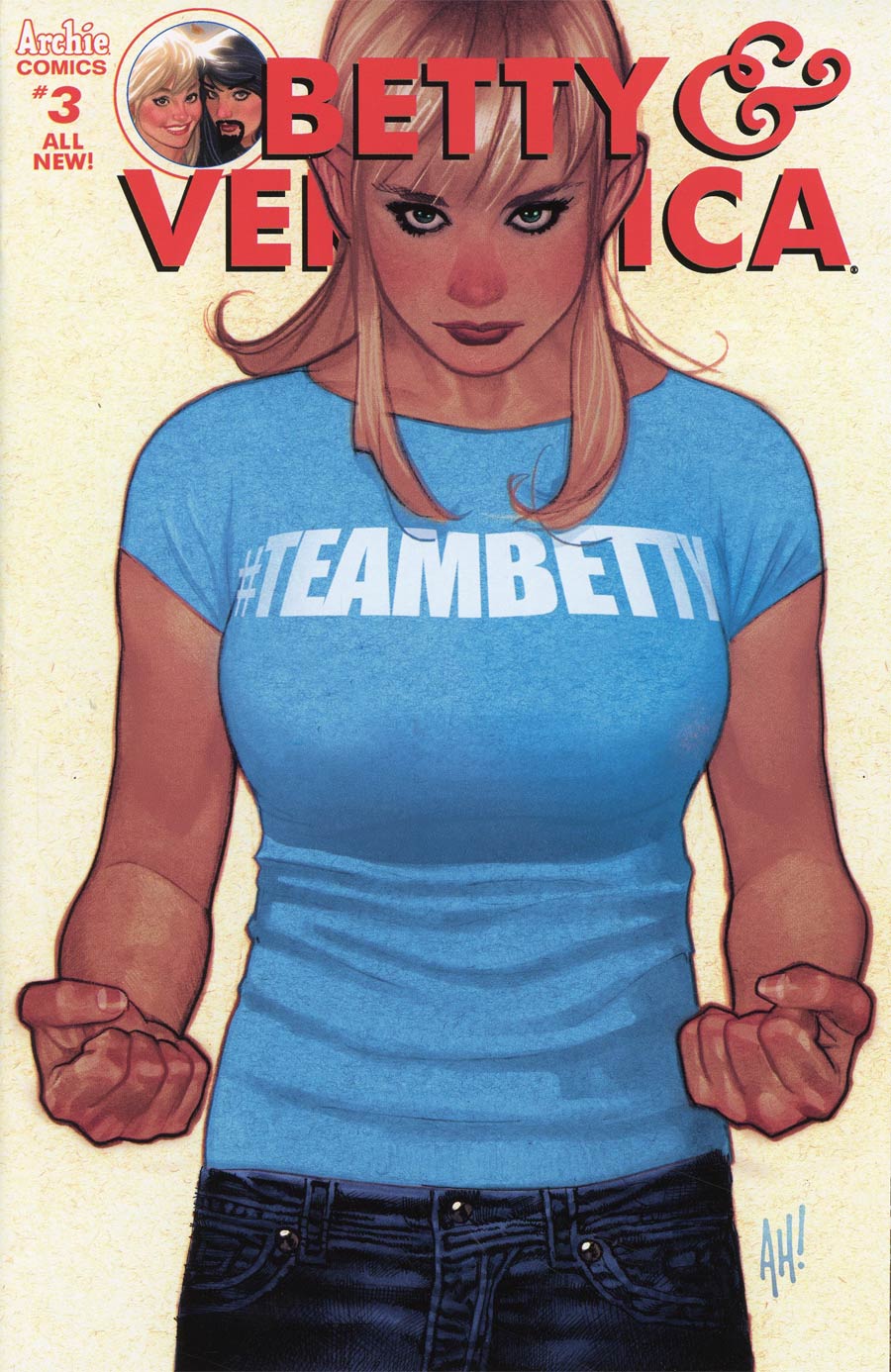
Besides Hughes’ writing, the thing that really sells this story is the art. All throughout, it has a bit of a gloomy feel, like the colors are covered by a haze of grey. If it were just a wee bit more orange, it’d almost pass for a Francisco Francavilla horror book. There’s even a gorgeous page that looks like it could have been lifted straight out of “Carrie”. But my favorite use of color may just be the whole “red vs blue” thing. Through the entire book, Betty and Veronica are each dressed in variations of blue or red, respectively. It’s so subtle, but hugely effective. I’ll be very curious to see if he keeps this up past this arc. I can’t wait for next month!
A Look Inside