The Walking Dead #130
Written by: Robert Kirkman
Art by: Charlie Adlard, Stefano Guadiano, and Cliff Rathburn
This issue is the fourth in "the new beginning" that takes place years after the initial timeline. In issue #127 we were transported to a mostly zombie-free utopia run by the legendary hero, Rick Grimes. The mood of the overall story shifted from survival of the entire group to Rick trying to deal with sustaining a community and a hormonal teenage Carl Grimes. This plays out pretty well in the post-apocalyptic world because everything a teenager complains about begins to seem extremely petty and not important when your whole life has been changed by a zombie takeover. Rick handles it like a pro, but Kirkman writes a lot of his own parental insecurities into Rick, you can tell pretty early on. And unfortunately I think they shifted the comic into the future because of the TV series. The actor who plays Carl is starting to grow up faster than he's supposed to and this would be a way to include him in future episodes. Even though the TV series does stray wildly from the comic, but whatever.
Robert Kirkman has become a comic legend in a very short amount of time. I've read a lot of interviews with him, seen him speak at panels at Comic-Con, and read his various other comics. The one gripe I've always had with this man is his splitting up of The Walking Dead's creative mediums. The comic is different from the TV series which is different from the novels which is different from the video games. I get it, more money = more content. The more you can divide your efforts, the easier the checks roll in. He's one of my favorite writers for simply changing the dynamics of the zombie genre. But he. like every writer, has faults. This issue was one of his good ones and the last line sets up something that I'm excited to see work...or not.
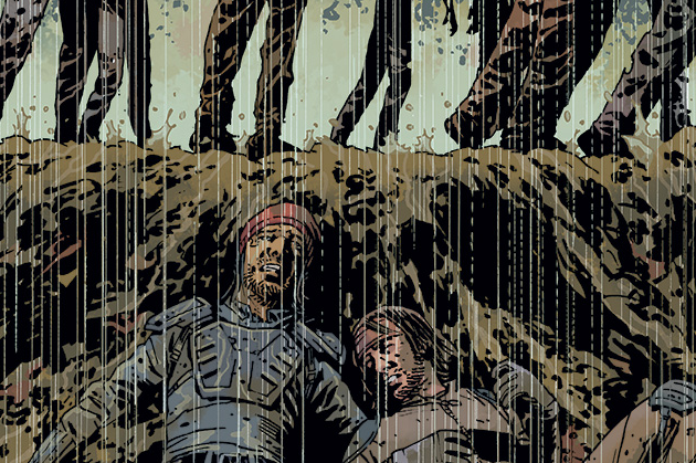
The art team always delivers in the atmosphere department. The black & white gives the words all the power and helps drive the somber story. It's an interesting technique that helps catapult Adlard's facial expressions into easily read dialogue. It's always been good and in any kind of depressing narrative, it'd be paramount.
This issue rules. Read it!


