Deathstroke #49 Review
Story: Christopher Priest
Pencils: Fernando Pasarin
Inks: Oclair Albert & Vincent Cifuentes
Colors: Jeromy Cox
Letters: Willie Schubert
Published by: DC
We are now at the penultimate issue of Christopher Priest’s Deathstroke and it begins with a question: “What makes a man a '’Villain’”? Asked by Deathstroke’s son Jericho, and the search for an answer encapsulates the issue.
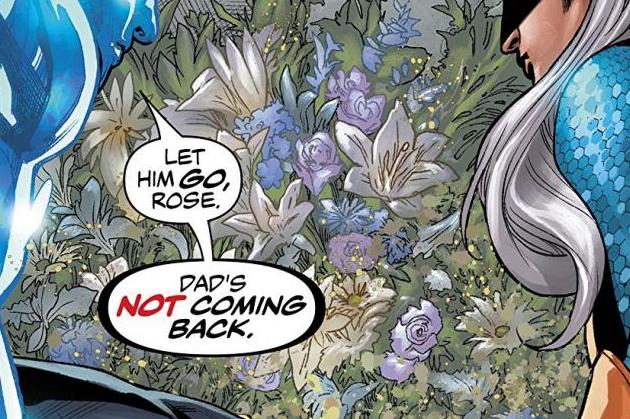
Now that Jericho is imbued with the power that Lex Luthor meant for Deathstroke, Priest shows us the events that lead up to Jericho floating in the aether of space, his collocutor a mystery to the reader. As we jump back an unspecified amount of time in the past, events unfold with Rose, Jericho and the man calling himself Deathstroke.
Priest does a good job of propelling the story forward as, even if you are new reader jumping into the story late, you are given enough tidbits throughout to give you an idea of what is going on. Jericho has taken over the “Gift” (as seen in all Year of the Villain tie-in series) and is using it how he sees fit and keeping it away from Deathstroke at all costs.
The familial interplay between the characters is a very interesting one and something I didn’t expect from this comic. I always knew Deathstroke had all these kids, but I never knew how their relationships played out. Here, Priest demonstrates that there is some love, some respect, but also plenty of hatred to go around. The last few moments of the issue do tug on the heartstrings a little as well.
Pasarin’s pencils are excessively clean throughout the issue thi issue as he makes every scene feel seamless. I was particularly impressed with the action scenes and how well choreographed they all are. If you pay close attention, you can see the movements that are being made of the characters within panel and between the panels. Very well done.
Added to that, the use of perspective throughout the issue added height and enormity to the confrontation Jericho is having with his collocutor. It gave it some gravitas and made it seem important.
Though the issue is inked by two different people, Albert and Cifuentes, there are no real noticeable differences throughout to my eyes. There were some rough patches here and there where faces just come off a little “wrong”, but for the majority of the issue, the inks did their job.
I am not as familiar with Jeremy Cox as a colorist, but I’ll have to start taking notice as his work in this issue elevates the art (as it should). The colors are vibrant when needed (the opening pages especially) and more muted when the action is more grounded. Really well done.


