Eve Stranger #1 Review

Writer: David Barnett
Artist: Philip Bond
Colorist: Eva de la Cruz
Letterer: Jane Heir
Published by: IDW
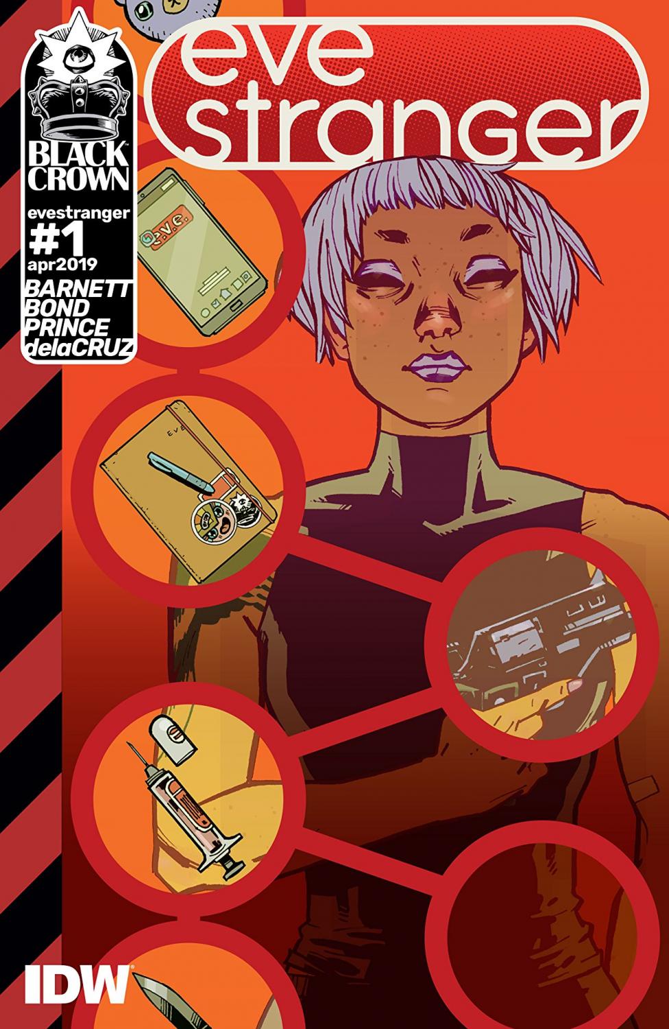
What if you woke up in a hotel room, not knowing who you are, your only sense of self dictated to you by a letter, written by who knows who, surrounded by a gun, an empty syringe, a passport with a name that sounds made up, and a credit card. And what if the first person you see is looking to do you harm? If that sounds any bit intriguing to you, you’ll love the first issue of Eve Stranger from the creative team of Barnett, Bon, de la Cruz and Heir.
The premise of this first issue is quite clear throughout: Barnett seeks to show the reader that his protagonist, Eve Stranger, has some form of amnesia where she can’t remember the last week of her life, has incredible skills - so motor function and memory for facts is not compromised, and there seems to a target on her back? We learn all this through the narration of the letter she found at the beginning of the issue. Within that letter, from an unknown author, it describes exactly what Eve will more than likely do, establishing that this is a pattern, and also what she must do.
It really is a very clever way to unpack a mystery and Barnett showcases just enough throughout the issue to keep things advancing at a steady pace all the while exploring the character of Eve. We get snippets throughout that tells the reader that even though Eve doesn’t know who she is, she is a creature of habit. Interspersed throughout her story are single page scenes that allow Barnett to develop a little bit of the world around Eve and how it might come into play within her story in later issues.
The art team of Bond, de la Cruz and Heir do a marvellous job throughout the first issue. Bond’s style is just this side of cartoonish and allows for some pretty great panel composition. He uses perspective really well as well from panel to panel as the “camera” is never still it seems. Too often you’ll static shot after static shot, but that isn’t the case here. This, combined with de la Cruz’s colors, allows the comic to have movement. I do enjoy the fact that de la Cruz’s colors also evoke a more indy feel to the comic with the use of shading, lighting and more muted colors.
All in all, this was a fun first issue that gives the reader just enough information that you want to know what will come next.
A Look Inside