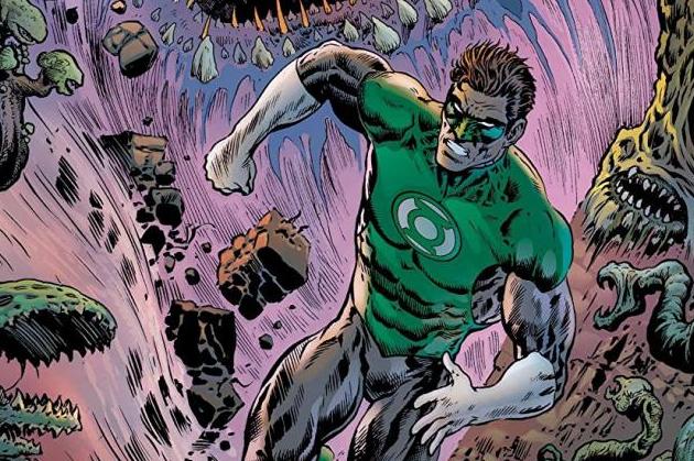
The Green Lantern #5 Review
Writer: Grant Morrison
Artist: Liam Sharp
Colorist: Steve Oliff
Letterer: Tom Orzechowski
Published by: DC
When jumping into a series that is already in the middle of a storyline can sometimes be jarring, other times, through good storytelling and amazing art work, it isn’t as bothersome. This is how I felt after the fifth issue of The Green Lantern by Sharp and Morrison. The set-up is Hal Jordan on a vampire planet named Vorr being tasked by Countess Belzebeth to prove himself worthy of being part of a group called the Blackstars.
If the preceding sounds confusing and convoluted, you needn’t worry as I was thinking the same in the first few pages, but by the end, I couldn’t help but be completely engrossed in the trials that Hal had to overcome. Morrison’s pacing works here as he reveals bit by bit what exactly Hal is doing on this planet, and why it’s important for him to overcome these trials. We don’t get the full picture by the end, but it serves well as a chapter of an ongoing story. Too often, and probably my number one pet peeve in comics today, writers will write for the trade and each single issue isn’t worth while on its own. This is not the case here as the trials Hal has to overcome could easily be a one-shot in of itself.
As much as the writing is excellent in this issue, the true stand out is Liam Sharp’s art coupled by Steve Oliff’s colors. I’ve mentioned before that I really enjoy Sharp’s hyper detailed artwork and that it truly fits with the classic sci-fi feel of this comic. On top of his detailed artwork, the panel framing in this issue is just too good. Putting aside the typical squares for this issue, Sharp plays around and uses elements from within the story to serve as panels. What this does is provide a more organic feel almost to every page. The best is one sequence where Hal is swinging around a torch that acts as the top panel for the next sequence.
If you were lucky enough to see the inked pages on Sharp’s twitter feed a few days ago, you’ll realize just how good Oliffe is in bringing that extra “oomph” to the page. The colors throughout convey the mood of the issue really well (Hal is fighting for his life to a certain degree) and help immerse the reader in the action.
This issue, and series, is a great example of how modern comics can pay homage to classic sci-fi while still being new and fresh. It’s a series that I slept on at first, but might have to become a fixture in my reading rotation sooner rather than later.


