Die #1 Review
Writer: Kieron Gillen
Artist: Stephanie Hans
Letterer: Clayton Cowles
Designer: Rian Hughes
Published by: Image
What ever happened to those kids from the Dungeons & Dragons cartoon from the 80s? Did they ever make it home?
If that question has been niggling in your head for these last 30 plus years (or 20 plus for those of us who watched the cartoon back in the 90s), then Kieron Gillen and company have their version of a solution for you! Die, as Kieron Gillen describes it in his end-of-issue letter, is the product of asking himself that very question above and he has gathered some of his closest contributors to bring a story to life that looks to provide an answer.
The central plot of Die is as such: a group of 6 teenagers in the early 90s gather around to play a pen and paper role-playing game à la D&D but with some twists. We meet Ash (The Dictator), Angela (Neo) Matthew (Grief Knight), Chuck (The Fool), Isabelle (Godbinder) and Sol (The Master and creator of the game).
But not everything is at it seems as Gillen flashforwards twice in a matter of pages once the game begins: one to two years from now with the kids on the side of the road, found after being missing for two years after that fateful night and not entirely whole; and two, to 25 years later as they live as adults, still coping with what happened to them all those years ago.
And what happened? Well, that is the big question and Gillen masterfully dances around the subject throughout the issue. It’s alluded to, and the generalities guessed at pretty easily, but specifics, that is clearly going to be the central mystery of this series.
I mentioned above that Gillen gathered some of his closest contributors to pull this off, and that is very true. On art, we have the incomparable Stephanie Hans who I still remember from their days collaborating on Journey Into Mystery for Marvel (one of the best books of the past decade in my opinion) and she just brings it to this new series.
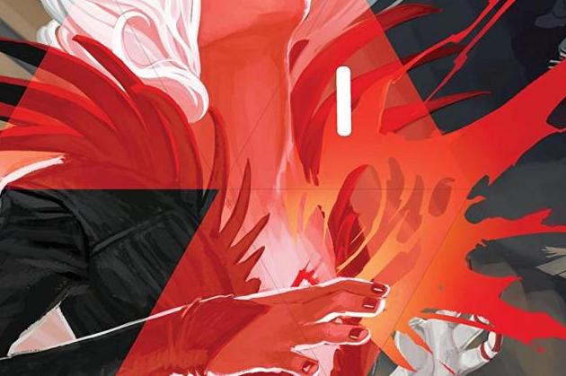
As her work is fully painted, you not only see the brushstrokes throughout, but you can almost feel them as well. Her use of light throughout is probably my favourite aspect of her art. She uses it to put into relief important set pieces and brilliantly uses it to set the mood as well. Probably my favourite sequence (one of many), is when Ash and Angela are outside in the rain as they leave a restaurant. Eschewing the need to draw the rain as individual droplets, Hans instead have the lights from nearby building reflect off the water as Anglea, dropping her bright red umbrella goes to comfort Ash. It’s an amazing, impactful two page sequence.
Clayton Cowles on letters is a legend in my mind and he continues his amazing.g work in this issue. Gillen mentions that Cowles has this knack of being to fit all his lengthy dialogue into onto the page without compromising the art, and that is true once again here. Though not as robust as their work on Journey Into Mystery, Gillen still packs a lot of the pages with dialogue and Cowles navigates the challenge with aplomb.
Last but not least is the design of the whole issue which is left to Rian Hughes. If there is one thing that I’m sure gets mentioned often enough when it comes to comic created by Kieron Gillen is the design of the trade dress, the covers, the logo and everything in-between. Well, a large part of that is thanks to collaborators such as Hughes who puts in some amazing work. You can see for most of the design that Hughes’ inspiration is the icosahedron (D20 die for those who didn’t use Google like I did to look that up).
If the first is anything to go by, this new series by Gillen, Hans, Cowles and Hughes will be another notch in the belt for Gillen and his inventive, artistic mind.


