Infinity Wars Iron Hammer #1 (of 2) Review
 Review")
Writer: Al Ewing
Artist: Ramon Rosanas
Color Artist: Jason Keith
Letterer: VC’s Cory Petit
Published by: Marvel
Infinity Wars at Marvel seems to have been going on for a long time already, and with its oversized price tag and monthly schedule, I’ve been almost reluctant to buy the issues month-to-month.
To borrow fellow reviewer Charles Martin’s rating system, I’ll give the Infinity Wars tie-ins either a Buy It or Skip It rating, since there aren’t that many, but there are enough.
Last week, I was harsh on Soldier Supreme mostly because of the fact that I found the rehash of Captain America’s origin story with a dash of Dr. Strange mixed in didn’t really work that well. This week we get the mixing of Iron Man’s origin with a massive amount Thor added into it and I really liked it.
You might ask what makes Iron Hammer different than Soldier Supreme and I would have to say it’s 100% the writing. Al Ewing is a rising start at Marvel and you can see why in this issue. Pretty much everyone who is a fan of Marvel these days knows Iron Man’s origin story (hell, it’s almost a beat for beat retelling and anyone who has seen the movie will instantly recognize it here). However, the way Ewing intersperses parts of not only Thor but Norse mythology itself within the story is what makes it stand out for me from Soldier Supreme.
The other thing that just elevated this issue for me was the use of explanatory captions. An art that has gone the way of the dodo bird in the last decade plus, Ewing utilizes this narrative element almost to perfection in this issue. It never feels forced and is used simply to inform readers of what they are seeing - which helps when trying to cram a whole newish mythology within only two issues.
For some reason, the art by Ramon Rosanas reminds of someone, but I can’t quite put my finger on who. However, his more subdued style works really well within the context of this issue. It’s not too overproduced and weirdly fits into an esthetic that I associate with Norse-style comics. This is helped by Jason Keith’s colours that are bright when needed but cold at other points.
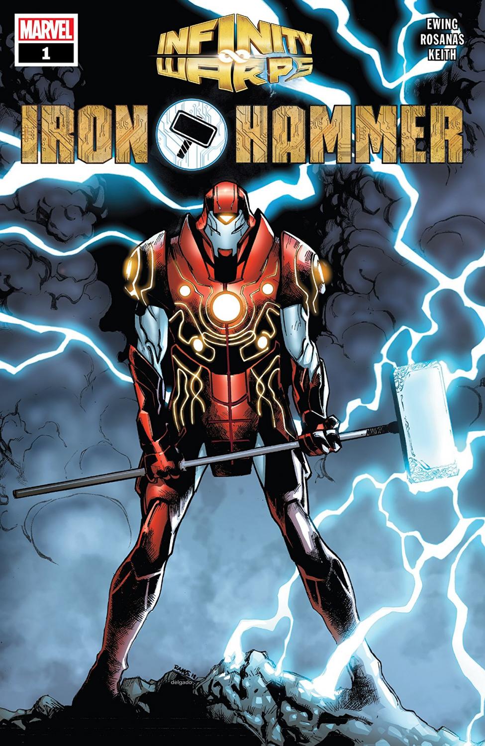
My only real issue with the art, and it might not even be Rosanas that created it, is the design of Iron Hammer. It feels bulky and I feel like they could have gone another direction. But hey, I’m not a character designer, so what do I know, right?
Iron Hammer gets a Buy it!
A Look Inside