Dungeons & Dragons Evil at Baldur’s Gate #1 Review
Written by: Jim Zub
Art by: Dean Kotz
Letters by: Neil Uyetake
Colors by: Stefani Rennee
Published by: IDW
What happens when a ranger and his pet space hamster are left to our own devices in the middle of sprawling Baldur’s Gate? Add to that he and his adventuring group are not currently welcome in the city and he’s out to find more adventure.
Well, that is exactly what Zub and company give us in this first issue of the new D&D comic and it was amazing. As a neophyte D&D player (I have been playing it for the past two years or so), one of the things that I love getting out of the game is a fun story that allows for a variety of characters to just have fun. Minsc the Mighty, or aforementioned Ranger, is exactly that type of character: he is not in it for the glory; he’s in it for the slaying of evil all while having fun. The added bonus that his familiar is a space hamster named Boo whom he converses with throughout the issue just makes him even more endearing.
As far as the plot goes, it isn’t anything too complicated but it fits the story that is being told. Minsc has just returned to Baldur’s Gate with his adventuring party where we learn they are not really welcome. Once there, however, the rest of the group has prior engagements leaving Minsc to his own devices. What does he do with his time, find trouble and vanquish evil of course! This all leads to a pretty interesting confrontation with the local hero and some bandits. Suffice it to say, nothing is as what it seems at first.
The strength of this issue is the writing from Zub. I have been a fan of his since his days on Skullkickers (another D&D inspired book). His chosen dialogue for Minsc is really what cinched it for me. You see, Minsc speaks in platitudes that only the dumbest of heroes would use but because of this, it makes him that much more endearing. Dialogue like “Evil always dies first,” said with the straightest of faces adds so much to the character that generic dialogue just cannot achieve.
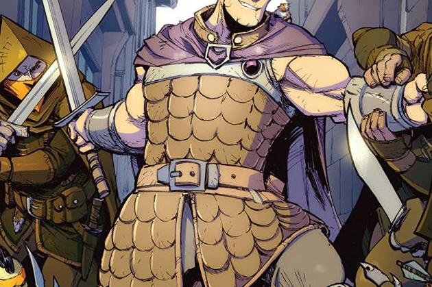
Kotz and Rennee do an admirable job on art making the city felt lived in and the action look crisp. Through no fault of their own, the fact that the setting is night time drowns out a little bit of the characters throughout the issue since most of them have a darker colour scheme. You can see that Rennee tries to bring added colour on each page, like the villain’s red cape, but it still makes for a pretty dark issue all around.


