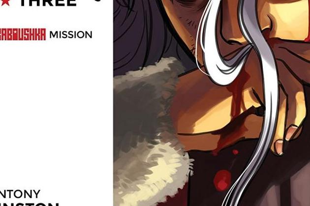
Ghost Station Zero Part Three
Story: Antony Johnston
Art: Shari Chankhamma
Publisher: Image Comics
If there is one thing this book does well, it’s the large scale action scenes that are certain to thrill. Johnston has done a good job throughout the series of utilizing old spy-style tropes, but giving them just enough difference to not fall into pastiche. In this issue, the big action scene involves Baboushka outracing an avalanche as she is being pursued by Helga, our quite deadly croupier that we met in issue one.
Though you have probably seen this scene a million times in James Bondesque films, Johnston is wise to keep the race against snow short and sweet to open the issue and transpose the cat and mouse battle to an unmanned construction site bordering the mountain. Here, we get to discover that Baboushka has truly met her match in the form of Helga, but that she is not without her own sense of inventiveness to get the job done.
But with all that said, she is still not any closer to discovering what these Ghost Stations are and neither is she any closer to catching up to Mr. Temple, our absent antagonist in this issue. However, being a well-trained spy, she, with the help of her handler Gyorgy, are able to hack into Temple’s work computer and ascertain the location of his next expedition to a Ghost Station.
Johnston is smart in this issue to keep the action going and barely stopping for a breath between Baboushka's adventures in the mountains to her skydiving into the Northern Canadian forests. This allows the issue to continue to feel like we are watching a spy-thriller unfold in front of us on the silver-screen. However, he also is able to add a brief respite to the action to further develop his character of Baboushka, letting us, the reader know, that she isn’t just all about the action, but that she is well-rounded spy as well. Her insight into how to discover Temple’s next move was spot-on and allowed her to “get” one over on her handler Gyorgy, who we have come to learn is quite the hacker.
Charnkhamma on art improved in this issue. There are still a few hiccups here and there - most notably Helga’s face for some reason - but in general, it was a much more pleasing visual experience. I can’t quite put my finger on it, but the colours this time around were more vibrant which enhanced the rest of the look of the comic.


