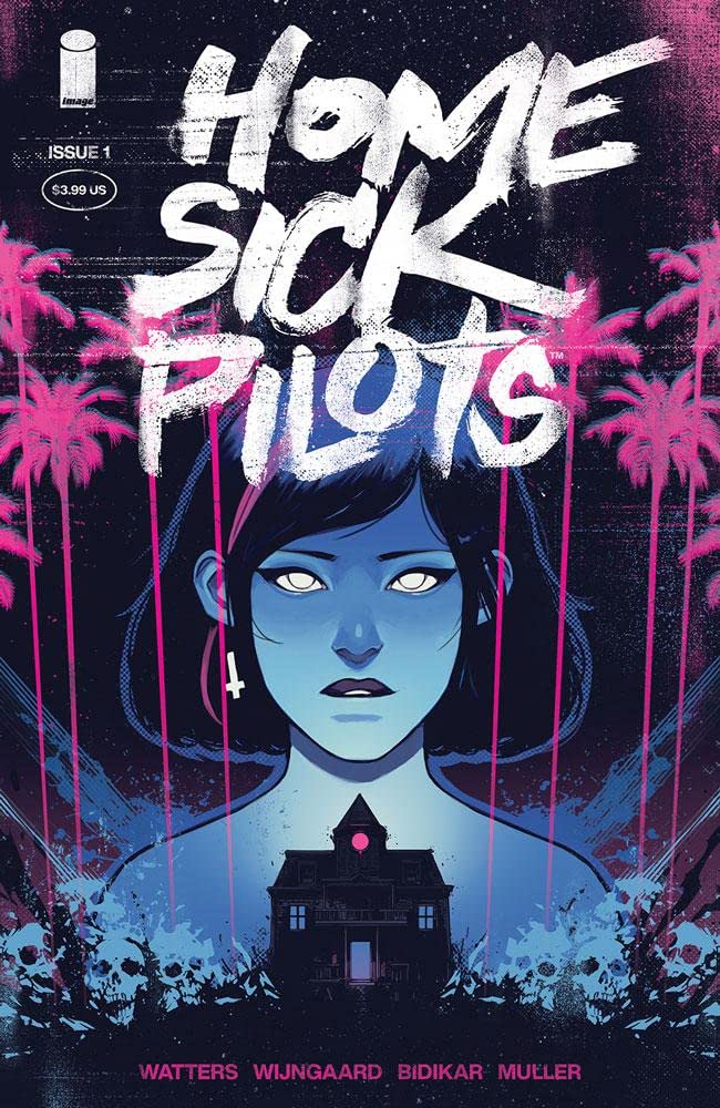
Home Sick Pilots #1 Review
Writer: Dan Watters
Artist: Caspar Wijngaard
Colours: Caspar Wijngaard
Letters: Aditya Bidikar
It’s incredibly difficult to sum up Home Sick Pilots. We’ve got a teenage punk rock band, and a haunted house, and the kind of chaos you’d expect from combining those two things. Image comics describe it as Power Rangers meets the Shining, and that’s a pretty accurate description after reading the first issue. It’s very early days in this new, ongoing series and Dan Watters wastes no time getting stuck into the story and trusts that readers will be able to keep up.
The first couple of pages let readers know the kind of wild ride they can expect, then the story flashes back to a few weeks earlier so that we can begin to make sense of it all. Our main character, besides the haunted house, is Amida, or Ami. Watters lets us spend a bit of time in this issue getting to know her and the rest of her punk rock band. She’s a classic rebel who has a tough background and readers will find themselves empathising and rooting for her. There is some really compulsive and exciting storytelling going on here, and if this debut is anything to go by this comic will be something pretty special.
Watters and Wijngaard have a background of working together and it shows here, there are some clever dramatic storytelling techniques used here to great effect. An example being a few pages which are black, apart from the white text, and it creates a real sense of drama.
Caspar Wijngaard does an incredible job with the art. If the concept of Power Rangers and The Shining together sounds unfeasible, the first couple of pages will change all of that. The haunted house is one of the main characters in the comic and Wijngaard brings that to life in an incredible fashion, giving it it’s own personality and filling it with the kind of horrors that readers have come to expect from haunted houses. Then there are his character designs. The characters are all filled with personality that leaps off the page.
And is all the stunning art from the very first page wasn’t enough readers reach a two page spread which is one of the many highlights of the comic. It is, in a word, outstanding. It tells the story is such a clever and unique way, two rival punk bands coming together for a confrontation. It’s one of those pages where readers will be amazed at the storytelling going on in front of them. It’s absolutely genius. It shows how the medium of comics can be utilised in really clever ways. There isn’t enough praise which can be heaped on these two pages.
A really exciting debut issue, readers owe it to themselves to pick this up and try it. A unique story which wouldn’t work in any other medium half as effectively as it does in comics, if the debut issue is anything to go by this is an ongoing you owe it to yourself to pick up. Watters and Wijngaard make a great creative team, the concept is fantastic, the writing is extraordinary, and the art is phenomenal.
A Look Inside