The Resistance #3 Review
Writer: J. Michael Straczynski
Artist: Mike Deodato Jr.
Colours: Lee Loughridge
Letters: Sal Cipriano
The third issue of The Resistance starts to take the series in a bit of a different direction from the first two. The first issue introduced us to a world ravaged by a pandemic, the second focused on the survivors, many of whom have developed powers, and how this shapes this new world. This third issue focuses on one of these survivors, James Struck, and his struggle to discover how he fits into this changing world.
It’s not just narratively different, the first two issues didn’t focus overly on any individual characters, rather a zoomed-out narrative on the world in general. It feels tonally quite different focusing on an individual, but it’s a great opportunity to explore this world in more depth. It also shows that characters who may have only featured in a panel or two in previous issues will be returning and getting a greater focus as this series, and shared world, expand further.
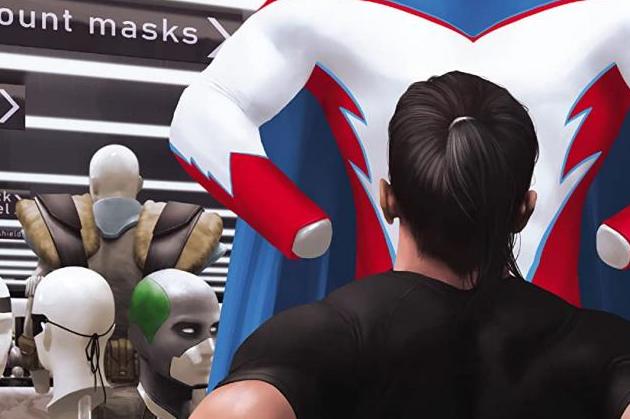
This issue follows James creating a superhero alter ego at the Swan Kirby Chase Power Placement Agency. In a nutshell, the government wants everyone with superpowers to have a licence to use them, and the agency is the place to get one. That’s an overly simplified explanation, but essentially anyone with powers needs to go to the agency.
The issue ends up feeling a little satirical, there are plenty of little nods and Easter Eggs in this issue, and feels a little reminiscent of either The Boys or The Incredibles. There is a lot of discussion around costumes and hero names and identities. Rather than being drawn into this world, Struck finds himself a little cynical of it all. It’s beautifully written, and despite at first glance appearing to be a parody of the superhero genre, it ends up reading as a more realistic take on how our world would react to superpowered beings popping up in our midst. One of the highlights is the Naming Wall, it’s filled with references that comic fans will delight over, and it’s such a terrible concept yet feels like natural for a big corporation like the agency to lap it up.
J. Michael Straczynski has poured a lot of love and time into this new shared universe, but it’s not until this issue that he spends time fleshing it out a little and letting us spend some time in it. The first issue felt like we were experiencing pockets of very human, character-driven story segments. This third issue is primarily focused on Struck, so the series doesn’t lose its character-focused stories, but is initially a little jarring because of its changed focus.
Mike Deodato Jr.’s art has been exceptional throughout the series. Each panel is a delight to feast your eyes on. This issue challenges him to introduce the superhero concept into this new universe, in a way which feels both natural and contrived, in keeping with the story being told, and he pulls it off easily. A superhero team briefly featured in the previous issue makes a return here, and each character is given a distinct look. Another talent of Deodato’s is he makes each character feel like a real human being, everyone is unique and not just another cardboard cut-out character.
Lee Loughridge’s colours continue to impress, pulling off incredibly different styles for each of AWA’s comics he works on. There are moments where the lighting he so successfully coloured for Old Haunts are on display here, and it helps to build on the sense of realism that the comic exudes. Then there are the deliberately over the top superhero costume designs, one bright yellow costume particularly stands out, which helps to build on the story being told.
Tonally quite different from the first two issues, by focusing on one character we’re beginning to get a feel for Straczynski’s new shared world. At times it feels like it’s bordering on a parody of the superhero genre, but it’s deliberately done and deftly handled so it never goes into full-on satire. It’s an exciting world and shared universe which is being crafted here, and readers will want to get in on the action now while it’s still forming. The art and colours continue to be out of this world, crafting a sense of realism that fits perfectly with the story.


