Guardians of the Galaxy #4 Review
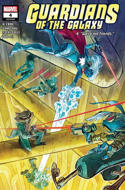
Writer: Al Ewing
Artist: Juann Cabal
Colours: Federico Blee & Guru-eFX
Letters: VC’s Cory Petit
With Al Ewings run on Guardians of the Galaxy he’s spending a lot of time making this team into his own version of the team. Once he'd killed Quill early on in the series it was clear this wasn’t going to be the Guardians we knew, and they’ve now fractured and disbanded into two separate teams which, following events in the previous issue, have now been positioned to come to blows. While it’s a well-known staple of comics that fans love to see their favourite heroes come to blows it’s a trope that can work incredibly effectively or can feel a little contrived. This issue leans a little bit more towards the contrived spectrum, but still makes for entertaining reading.
One team of Guardians have been hired to protect an energy source by Blackjack O’Hare, who has a history and personal vendetta against Rocket, while the other team are determined to destroy it. Where this scenario falls apart however is the energy source quite clearly uses technology based off Galactus, and no-one in their right mind could be persuaded that this is a good idea. However, the division between the two teams of Guardians is real, and that aspect of the conflict is not only believable but feels inevitable.
Al Ewing feels like he’s in no real hurry to assemble his team, rather focusing on a natural series of events and letting them ride to their natural conclusion. It’s far too early in his run to determine what state our new team of Guardians will end up, but that’s half the excitement of the series. It’s been good to have a major focus on Nova, before the Guardians of the Galaxy films he was an integral part of Marvels cosmic series, but with his absence from the movie he’s been relegated to the sidelines for too long. He’s clearly suffering and it makes an interesting focus for the character.
There’s also been more focus on Phyla-Vell, Moon Dragon(s) and Marvel Boy. Not only is it nice to focus on characters who haven’t been seen too much in recent years, they are all natural inclusions to the Guardians of the Galaxy’s team of misfits. Like Nova, Phyla-Vell and Moon Dragon have played an important role in Marvels Cosmic in the past, and have an existing history and role with the Guardians, so it’s nice to see a return to those characters. By including them in his run Ewing is demonstrating not only his knowledge of the characters and their history, but also his love for the role they’ve played in the past. It feels like a return to the days of Dan Abnett & Andy Lanning, who had one of the most incredible runs from Annihilation right through to the Thanos Imperative.
Juann Cabal has been an excellent fit for the Guardians. He’s made all the different alien planets the series has visited so far feel really alien and otherworldly. Not only that but he’s made all the different characters look fantastic. They’ve all been through a lot over the past little while, Drax’s death and subsequent resurrection etc., and as a result of this they each have a new look, and Cabal has managed to give them a very iconic look which is very much his own creation, while being faithful to everything which has come before, and more reminiscent of their classic appearances than the more modern takes.
The colours from Federico Blee & Guru-eFX manage to complete the alien-ness of the planets and characters, reminding readers that they’re not in Kansas anymore. They’re a good match for Cabals art and manage to complete the iconic look and style that is part of this new run on Guardians of the Galaxy. Not only that but the colours throughout the issue are absolutely incredible and there are a few moments where they'll dazzle readers.
Al Ewing’s take on the Guardians of the Galaxy is managing to be faithful to everything which has come before, he demonstrates his knowledge of their history, while also making them very much Ewings team of the Guardians. The conflict between the two fractured teams is a little contrived but also in fitting with everything they’ve experienced over the past little while, and feels like they’re naturally being moulded by events into whatever team Ewing has planned. The art completes the new and iconic team, giving them a look that’s both unique and more reminiscent of their classic look. If it lives up to its promise this is a run which could rival Dan Abnetts iconic cosmic run.
A Look Inside