Old Haunts #1
Writers: Ollie Masters & Rob Williams
Artist: Laurence Campbell
Colours: Lee Loughbridge
Letters: Sal Cipriano
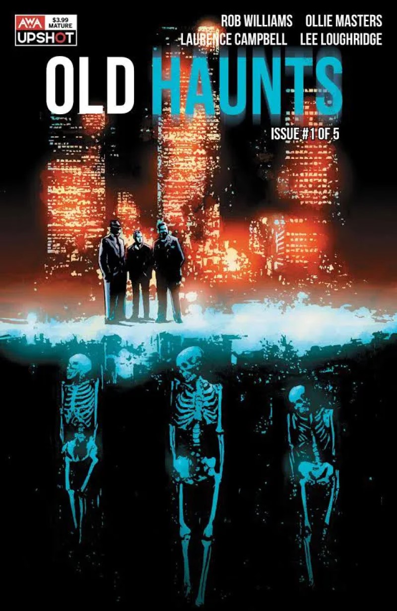
Old Haunts #1 is a glorious mishmash of various different genres which aren’t normally bedfellows. It’s a gorgeous, haunting, noir, supernatural gangster story set against the bright backdrop of L.A. at night. Campbells artwork is incredibly cinematic and captures the feel of a Scorsese movie. The bright, urban feel of downtown L.A. feels like it should be a direct antithesis to the traditional ghost story yet works fantastically.
The story follows three aging gangsters who are in various states of going on the straight and narrow, not all willingly. There is a lot of history between them all, and the superb writing gives enough hints at their past without feeling the need to spend time on needless exposition. It’s deliberately paced and pulls the reader deep into the story.
Ollie Masters & Rob Williams collaborate really well to produce a confident first issue, getting the balance between all the disparate elements creating an exciting debut. The best stories are rarely confined to one genre, and here we have several, all with twists on the standard delivery, keeping the reader guessing what is going on. It only takes a few scenes and lines of dialogue focusing on each of the characters to get a good understanding of the kind of men they are. One of the most atmospheric comics to be released in a long time.
Laurence Campbell’s artwork is incredible here. It really sets the noir tone of the comic. The panels are all wide but short, giving a widescreen feel to each panel, which contributes to the cinematic feel of the issue. He perfectly captures downtown L.A., the haunted expressions on our characters faces, and no stranger to drawing the supernatural, his BPRD experience show here as well. Campbells art is worth the price of admission alone, the fact that Masters and Williams writing is equally great make this an incredible debut issue.
There are some gorgeous double page spreads which really cement him as one of the most atmospheric artists in the business. His heavy inks and shadows are create a moody atmosphere which fits the tone of the story. There is a sequence towards the end which really stands out as a highlight of the issue. It’ll be instantly recognisable, thanks to some clever colour choices from Lee Loughbridge, coupled with Campbells artwork, and the tension is subtly raised for the readers to the ignorance of the main characters.
Continuing on with Loughbridges colours, the bright lights of L.A.’s nighttime contrast fantastically with Campbells heavy inking and produce a really stylistic piece. Towards the end of the comic he chooses to use a shade of purple as the more supernatural elements of the comic make an appearance. It helps change the atmosphere and let the reader know something is going on. It works incredibly well. Loughbridge and Campbell make such a perfect team and I hope to see them collaborating more in the future.
A stylistic, cinematic tale of gangsters haunted by their past decisions, it’s unclear whether it's the intense writing or stunning art which is the biggest highlight of the issue. This is an excellent example of a fantastic collaboration between the entire creative team to produce a chilling debut issue in another excellent offering from AWA studios. A highly recommended new series.
Artist: Laurence Campbell
Colours: Lee Loughbridge
Letters: Sal Cipriano
Old Haunts #1 is a glorious mishmash of various different genres which aren’t normally bedfellows. It’s a gorgeous, haunting, noir, supernatural gangster story set against the bright backdrop of L.A. at night. Campbells artwork is incredibly cinematic and captures the feel of a Scorsese movie. The bright, urban feel of downtown L.A. feels like it should be a direct antithesis to the traditional ghost story yet works fantastically.
The story follows three aging gangsters who are in various states of going on the straight and narrow, not all willingly. There is a lot of history between them all, and the superb writing gives enough hints at their past without feeling the need to spend time on needless exposition. It’s deliberately paced and pulls the reader deep into the story.
Ollie Masters & Rob Williams collaborate really well to produce a confident first issue, getting the balance between all the disparate elements creating an exciting debut. The best stories are rarely confined to one genre, and here we have several, all with twists on the standard delivery, keeping the reader guessing what is going on. It only takes a few scenes and lines of dialogue focusing on each of the characters to get a good understanding of the kind of men they are. One of the most atmospheric comics to be released in a long time.
Laurence Campbell’s artwork is incredible here. It really sets the noir tone of the comic. The panels are all wide but short, giving a widescreen feel to each panel, which contributes to the cinematic feel of the issue. He perfectly captures downtown L.A., the haunted expressions on our characters faces, and no stranger to drawing the supernatural, his BPRD experience show here as well. Campbells art is worth the price of admission alone, the fact that Masters and Williams writing is equally great make this an incredible debut issue.
There are some gorgeous double page spreads which really cement him as one of the most atmospheric artists in the business. His heavy inks and shadows are create a moody atmosphere which fits the tone of the story. There is a sequence towards the end which really stands out as a highlight of the issue. It’ll be instantly recognisable, thanks to some clever colour choices from Lee Loughbridge, coupled with Campbells artwork, and the tension is subtly raised for the readers to the ignorance of the main characters.
Continuing on with Loughbridges colours, the bright lights of L.A.’s nighttime contrast fantastically with Campbells heavy inking and produce a really stylistic piece. Towards the end of the comic he chooses to use a shade of purple as the more supernatural elements of the comic make an appearance. It helps change the atmosphere and let the reader know something is going on. It works incredibly well. Loughbridge and Campbell make such a perfect team and I hope to see them collaborating more in the future.
A stylistic, cinematic tale of gangsters haunted by their past decisions, it’s unclear whether it's the intense writing or stunning art which is the biggest highlight of the issue. This is an excellent example of a fantastic collaboration between the entire creative team to produce a chilling debut issue in another excellent offering from AWA studios. A highly recommended new series.
A Look Inside