Ravencroft #3 Review
Writer: Frank Tieri
Artists: Angel Unzueta & José Luis with Scott Hanna
Colours: Rachelle Rosenberg
Letters: VC’s Joe Sabino
The intro to this issue is a great example of what this series is getting wrong. The prisoner in Cell 616 is revealed (this is a spoiler free review, you’ll need to read the issue to find out who) and his character is written in such a shoddy, lazy way. Especially since he’s also in his own series released on the same day as this issue and the comparison between the two demonstrates how poorly written he is. His presence here is for the shock factor after the reveal. How he behaves is not in keeping with his character, in the slightest, and this poor portrayal of the character is exactly what is wrong with this comic.
There are twists and turns, and plenty of moments that will surprise the reader. Where it goes wrong however is in the execution. Frank Tieri deserves praise for his plotting, it’s just disappointing that the end result doesn’t live up to that potential. It is also never clear quite what tone it’s going for. It doesn’t pull of the horror vibe it’s obviously trying for, and leaves it feeling a bit of a mess.
Then there’s the overall plot. It’s still a bit hazy as what is going on, what anyones motivations are, or why we should care. It feels like jumping from one crazy twist or reveal to another, unconnected and unrelated. Sometimes the mystery will keep a reader returning issue after issue. Othertimes the reader loses interest, especially when there’s no characters to root for, nothing to engage the reader. If the quality of the writing was there the reader would want to return each month. The mysteries would tease and tantalise. But when the quality of the writing is lacking then so does the readers interest.
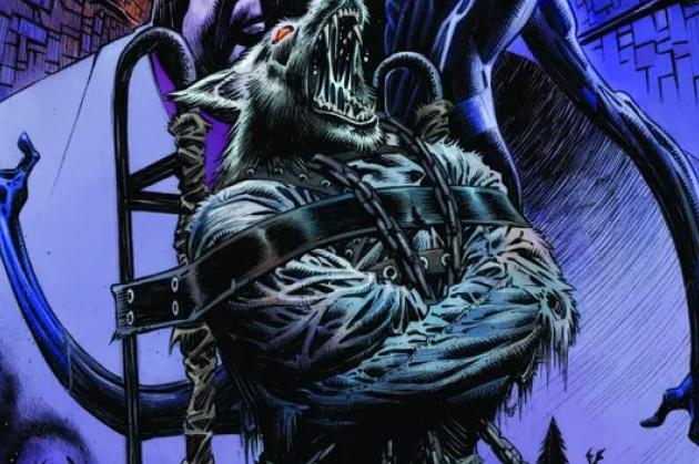
The art has been good throughout the series and this issue continues that trend. It’s quite a sizeable art team working on this comic, we have Angel Unzueta, José Luis, Scott Hanna on the art with Rachelle Rosenberg on colours. The only exception in this issue is the character who is revealed near the start. His likeness is poorly captured and makes him look like a typical henchman rather than the character he is. However art is subjective and some readers are sure to like his portrayal. The ‘Unwanted’ are quite inspired and one of the highlights of the art.
Good art is unfortunately not enough to elevate the lazy writing. Twists and turns, shock reveals, don’t make a good comic. The rest of the writing needs to be of a high standard as well. It’s a shame the effort that’s gone into plotting these twists doesn’t extend beyond that. If things don’t improve soon this series is sure to lose readers.


