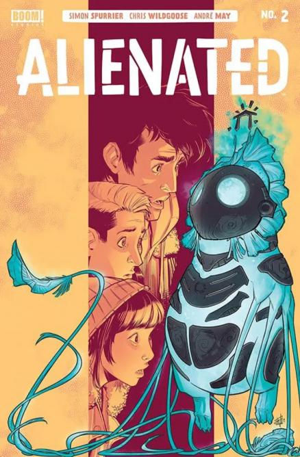
Alienated #2
Writer: Simon Spurrier
Artist: Chris Wildgoose
Colours: André May
Letters: Jim Campbell
The debut issue of Alienated gave us a fantastic story and great set up for the series. The second issue expands on everything from the first issue and takes the story in totally different and unexpected directions.
We learned at the end of the last issue that Chip (that’s the name given to the alien they found) has a dangerous side. Entrusting this alien to three teenagers, who are still finding themselves, and, without stereotyping, are as irresponsible and self absorbed as most teenagers, mean this series is going to go down some dark and morally grey areas. It also asks the question of whether power corrupts? Asks it but leaves it to the reader to decide.
Where the first issue the narrative switched between the three Sams, this issue is narrated by Samuel, and it gives us a chance to learn more about him. All three main characters are really well realised, their insecurities and personalities shine through and make them all incredibly relatable. Even the characters we aren’t supposed to like, Chelsea, Leon in the previous issue, all feel like real people.
And speaking of Leon there are going to be consequences to his death at the end of the previous issue. His disappearance is a big part of this issues storyline.
Simon Spurrier’s writing is incredible here. I don’t think I’ve ever read a comic which so deeply explores the characters psyches and personalities and it makes for some fantastic reading. Spurrier also avoids the mistake of trying to use teenagers lingo in their talking.
Spurriers storytelling is one of the highlights of the comic, but just as important is Chris Wildgooses art. All the characters have distinctive looks and flaws, which makes them appear more real. I’m a big fan of his work, each panel is incredibly detailed. The characters are real, the settings are so intricately drawn and vivid, the characters thoughts and feelings are written all over their faces. That’s before we get to the more exotic parts of the art. Chip is one of the best creations I’ve ever seen in a comic, suitably alien and at times cute, others dangerous and threatening.
Then we have André May’s colours. If Wildgooses art is great, then May’s colours are the icing on the cake. The scene’s with Chip in distinguish themselves with the more exotic colours, and contrast nicely with the subtler scenes where Chip isn’t present. And of course the clever use of colours helps distinguish the main characters from each other. A clever storytelling trick which helps keep the reader following along with little to no effort.
Only two issues in and I’m already predicting this seriers will end up being one of the greats, and make frequent appearances on ‘best of’ lists. Simon Spurrier’s writing excels as always, Chris Wildgoose’s art is one of the highlights, André May’s colours add a lot to the storytelling. A deep look into the human psyche, each of its character is flawed and human, a commentary on social media and its influences on society, morally grey. There are some great concepts on display here.
A Look Inside