Alienated #1 Review
Writer: Simon Spurrier
Artist: Chris Wildgoose
Colors: André May
Letters: Jim Campbell
A first issue can be incredibly difficult to get right. It’s far too easy to get lost in setting the story up that the focus is taken away from telling the story. Simon Spurrier has shown in the past he knows how to hit the ground running with a first issue that pulls us straight into the narrative, so that we forget we’re reading a debut issue and can really enjoy it (Just look at Hellblazer #1). He pulls off this trick again here, no mean feat, and makes it look easy to boot.
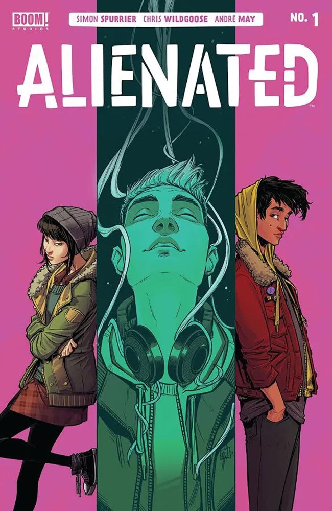
So what is Alienated? We follow three high school kids, Samuel, Samantha and Samir. They each have very different and distinct personalities. One thing they all have in common? In that way that most High School kids are, they’re still finding themselves (In fact why stop at High School? That's something that follows most of us into Adulthood as well). They possibly just have a little further to go than most to work out who they are, and stop worrying about everyone else. And it's these insecurities which leads to the title of the comic, Alienated. All three find themselves feeling alone and isolated. Or Alienated, if you will (And you thought the title of the comic was because of the Alien). What I like about all the characters is how relatable they are. We either know them or we know someone like them. We may even have been them at some point in our lives.
We spend a little bit of time being introduced to these three characters then, when we have a pretty good grasp on who they are, a chance encounter finds the three of them together, discovering something Alien. I won't say any more about the plot to avoid spoilers but know that it doesn't disappoint. All I will say is it takes a totally unexpected direction from there, with all three kids finding an unwelcome bond between them.
It makes for an incredibly interesting series, where the reader is hooked in and pulled along, so much so that all too soon it’s over and we’re left craving more. I have no idea where the rest of the series is going to go but I know I’m in this for the ride. We may have an Alien at the centre of this story, with powers and telepathy, but that’s not what this story is about. It’s about three kids finding themselves, a coming of age story, and the Alien just gives an interesting backdrop for this story. It’s a running commentary on our society and social media.
And I haven't even mentioned Chris Wildgoose's art yet. It's incredible. Definitely one of the selling points of the comic. He manages to give each character a very unique look which helps bring their personalities to life. He manages to mix the more fantastical elements with the more mundane in a way that makes everything feel real. And for a story that relies heavily on the three main characters he captures all of their expressions perfectly so we know exactly how they feel about everything. Then there's a double page spread where the kids first find the Alien that is fantastic.
André May’s colors are brilliant. Each character has a distinct color that represents them and his use of colors reinforces that, sometimes obviously, more often subliminally. It’s a nice touch which really adds to the comic. Then we have all the scenes with the alien. His colors really add to the alien-ness of it all and give it a unique style. It genuinely looks like it’s glowing on the page.
I have to admit one of the creators who is regularly overlooked in my reviews is the letterer. Not so in this review: Jim Campbell deserves a mention here. In such a complicated tale where we have not only telepathy but speech bubbles it would be easy to overcomplicate the story to the point where the reader struggled to follow along but not once did I have that problem here. A big part of that is down to Jim Campbell’s letters, and how each characters inner thoughts are color coded. A shout out is deserved for whoever chose which character got which color as it works really well.
An exciting debut issue. Incredible writing hooks you in, outstanding art pulls you deep inside the comic, the colors bring it all to life and expert lettering makes a complex story readable with ease. A fantastic but subtle look at society and social media, this promises to be a great story. This is a comic that plays to all the strengths of the medium and wouldn’t work nearly as well in a different format.
Artist: Chris Wildgoose
Colors: André May
Letters: Jim Campbell
A first issue can be incredibly difficult to get right. It’s far too easy to get lost in setting the story up that the focus is taken away from telling the story. Simon Spurrier has shown in the past he knows how to hit the ground running with a first issue that pulls us straight into the narrative, so that we forget we’re reading a debut issue and can really enjoy it (Just look at Hellblazer #1). He pulls off this trick again here, no mean feat, and makes it look easy to boot.
So what is Alienated? We follow three high school kids, Samuel, Samantha and Samir. They each have very different and distinct personalities. One thing they all have in common? In that way that most High School kids are, they’re still finding themselves (In fact why stop at High School? That's something that follows most of us into Adulthood as well). They possibly just have a little further to go than most to work out who they are, and stop worrying about everyone else. And it's these insecurities which leads to the title of the comic, Alienated. All three find themselves feeling alone and isolated. Or Alienated, if you will (And you thought the title of the comic was because of the Alien). What I like about all the characters is how relatable they are. We either know them or we know someone like them. We may even have been them at some point in our lives.
We spend a little bit of time being introduced to these three characters then, when we have a pretty good grasp on who they are, a chance encounter finds the three of them together, discovering something Alien. I won't say any more about the plot to avoid spoilers but know that it doesn't disappoint. All I will say is it takes a totally unexpected direction from there, with all three kids finding an unwelcome bond between them.
It makes for an incredibly interesting series, where the reader is hooked in and pulled along, so much so that all too soon it’s over and we’re left craving more. I have no idea where the rest of the series is going to go but I know I’m in this for the ride. We may have an Alien at the centre of this story, with powers and telepathy, but that’s not what this story is about. It’s about three kids finding themselves, a coming of age story, and the Alien just gives an interesting backdrop for this story. It’s a running commentary on our society and social media.
And I haven't even mentioned Chris Wildgoose's art yet. It's incredible. Definitely one of the selling points of the comic. He manages to give each character a very unique look which helps bring their personalities to life. He manages to mix the more fantastical elements with the more mundane in a way that makes everything feel real. And for a story that relies heavily on the three main characters he captures all of their expressions perfectly so we know exactly how they feel about everything. Then there's a double page spread where the kids first find the Alien that is fantastic.
André May’s colors are brilliant. Each character has a distinct color that represents them and his use of colors reinforces that, sometimes obviously, more often subliminally. It’s a nice touch which really adds to the comic. Then we have all the scenes with the alien. His colors really add to the alien-ness of it all and give it a unique style. It genuinely looks like it’s glowing on the page.
I have to admit one of the creators who is regularly overlooked in my reviews is the letterer. Not so in this review: Jim Campbell deserves a mention here. In such a complicated tale where we have not only telepathy but speech bubbles it would be easy to overcomplicate the story to the point where the reader struggled to follow along but not once did I have that problem here. A big part of that is down to Jim Campbell’s letters, and how each characters inner thoughts are color coded. A shout out is deserved for whoever chose which character got which color as it works really well.
An exciting debut issue. Incredible writing hooks you in, outstanding art pulls you deep inside the comic, the colors bring it all to life and expert lettering makes a complex story readable with ease. A fantastic but subtle look at society and social media, this promises to be a great story. This is a comic that plays to all the strengths of the medium and wouldn’t work nearly as well in a different format.
A Look Inside