John Constantine: Hellblazer #3 Review
Writer: Simon Spurrier
Artist: Aaron Campbell
Colors: Jordie Bellaire
Letters: Aditya Bidikar
I’ve made no secret of the fact that I am a huge fan of this new Hellblazer series. I even named it best ongoing comic of 2019 (Click here for that and other favourites of the CTG staff). This third comic continues that trend. This series is something special, the perfect match of writer, artists and colorist to make a truly outstanding series.
This third issue is an excellent conclusion to the initial storyarc, ‘A Green and Pleasant Land’. The stakes and the mystery having been set up in the previous two issues here we get some answers and then John’s solution. And of course because this is Constantine nothing ever goes smoothly and another well intentioned solution to the problem only makes things worse.
Simon Spurrier has already, in only three issues (four if we include the Sandman Presents issue), set up a fantastic supporting cast of characters who arrived on the page fully formed and lots of fun. It’s an impressive testament to his writing that it’s taken such a short space of time to create such a great ensemble of characters.
This comic has it all, we’ve got humour, we’ve got scares, it’s tragic, it’s fun. There are some truly standout moments. We’ve got a little more of Noah’s sign language. We get a return of Detective Dole in a funny reversal of his introduction. Some funny lines from Constantines possessed phone. A bit of a bigger role from Nat and we begin to see where she might fit in Constantines world. We also get the first sign of Constantine missing Chas, which hasn't been mentioned so far. Although since this is Constantine it’s debatable whether he misses Chas or his wheels.
I liked where they took the William Blake storyline. I’d been enjoying it but couldn’t see how they were going to conclude it in a satisfactory way. Not only did they conclude it but it was clever and well done. A little bit tragic, it also manages some scares and humour. I cannot stress enough just how good Spurrier's writing is. This is classic Constantine and I wouldn’t change a thing about this comic.
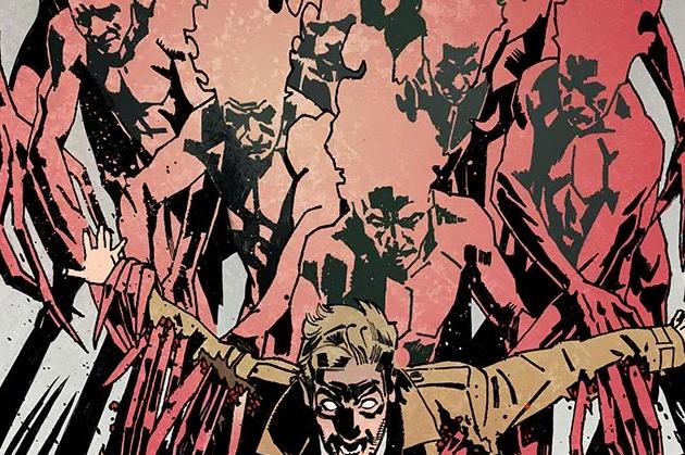
Aaron Campbell’s art is on top form as always. He brings Constantines world to life in such an incredible way. And it doesn’t matter what he’s drawing, whether it’s fantastical Cherubim, quiet London streets, packed buses, chats on benches, all his work is gorgeous. His style is also quite distinctive, a perfect fit for Hellblazer, part of what makes it so special.
I’ve mentioned before that a good color artist almost fades into the background. If they’re doing their job right you aren’t aware of them. That’s not the case here. Jordie Bellaires colors are out of this world. They need to be seen to be believed. They add so much to the comic. The cherubim almost hurt your eyes to look at they’re so bright. Then we have scenes with the Haruspex and his magic which are sickly greens or bloody reds, the colors help set the scene. Poorly lit park benches. She brings Campbell's art to life.
The third issue cements any doubts that this series is something special. An incredible pairing of writer, artist and colorist make this comic one of the best on the shelves at the moment. Simon Spurriers got such a good grasp of what makes John Constantine so great and has populated his world with characters who feel so real they practically jump off the page. Aaron Campbell manages to bring Constantines London to life in the most incredible way. Jordie Bellaires colors have to be amongst the best in the industry and really atmospheric. This is the comic I look forward to most month after month.


