Yondu #4 Review
Writers: Zac Thompson & Lonnie Nadler
Artist: John McCrea
Colors: Mike Spicer
Letters: VC’s Joe Caramagna
This series has been a real surprise hit for me. After a bit of a shaky start it’s hit its groove and it’s really good fun. The two Yondu’s, different in every way, are finally starting to bond and share a bit of their history and understand each other. There’s a bit of a mutual respect between them and they’re even beginning to grow and develop as they learn from each other.
This is what I was expecting from the beginning and while it took its time to get here I’m glad it did. The biggest part of this issue, once they get out of the jam they found themselves in at the end of the last one, has been focusing on present day Yondu’s backstory.
It unfolded more or less as expected. Previous issues had given us enough information to have a rough idea what happened. That’s not a criticism either though, it was interesting to learn how present Yondu found himself on the path he did. It was no more than a foolish choice as a kid, which left him on a path he felt he had no choice to follow. It was both tragic and helps to explain why Yondu is the way he is, why he chose, against Centaurian way, to embrace technology and keep his fin shaved.
He’s turned into a bit of a loveable rogue and I look forward to seeing where the next issues conclusion leaves him. It’s clear that whatever happens both Yondus are irreversibly changed after meeting, both have grown as characters.
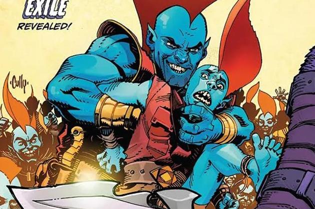
I’ve commented in all my other reviews how much I’ve enjoyed John McCrea’s art and this issue carries on that trend. There are a few panels were we see the Two Yondu’s side on talking to each other and it’s interesting to see the differences. You could believe with a different start in life they could look very similar, but instead we have present Yondu with his fin cut short, gold teeth and misshapen nose, opposite future Yondu who’s far more traditional. It’s a nice parallel between them and only adds to the feel that despite their very different backgrounds they could have turned out the same.
Then there’s a double page spread near the end with a fantastic fight scene, which doesn’t follow the traditional panel by panel format, instead it’s more of a sideways s shape but McCrea’s fantastic art has you following the battle with no difficulty and is a standout example of the kind of thing that I love about his art.
The buddy movie is really beginning to shine, I recommend getting through the earlier shakier issues just for this issue. Great writing, even better characterisation, and an art style that perfectly compliments the story make Yondu a surprise hit.


