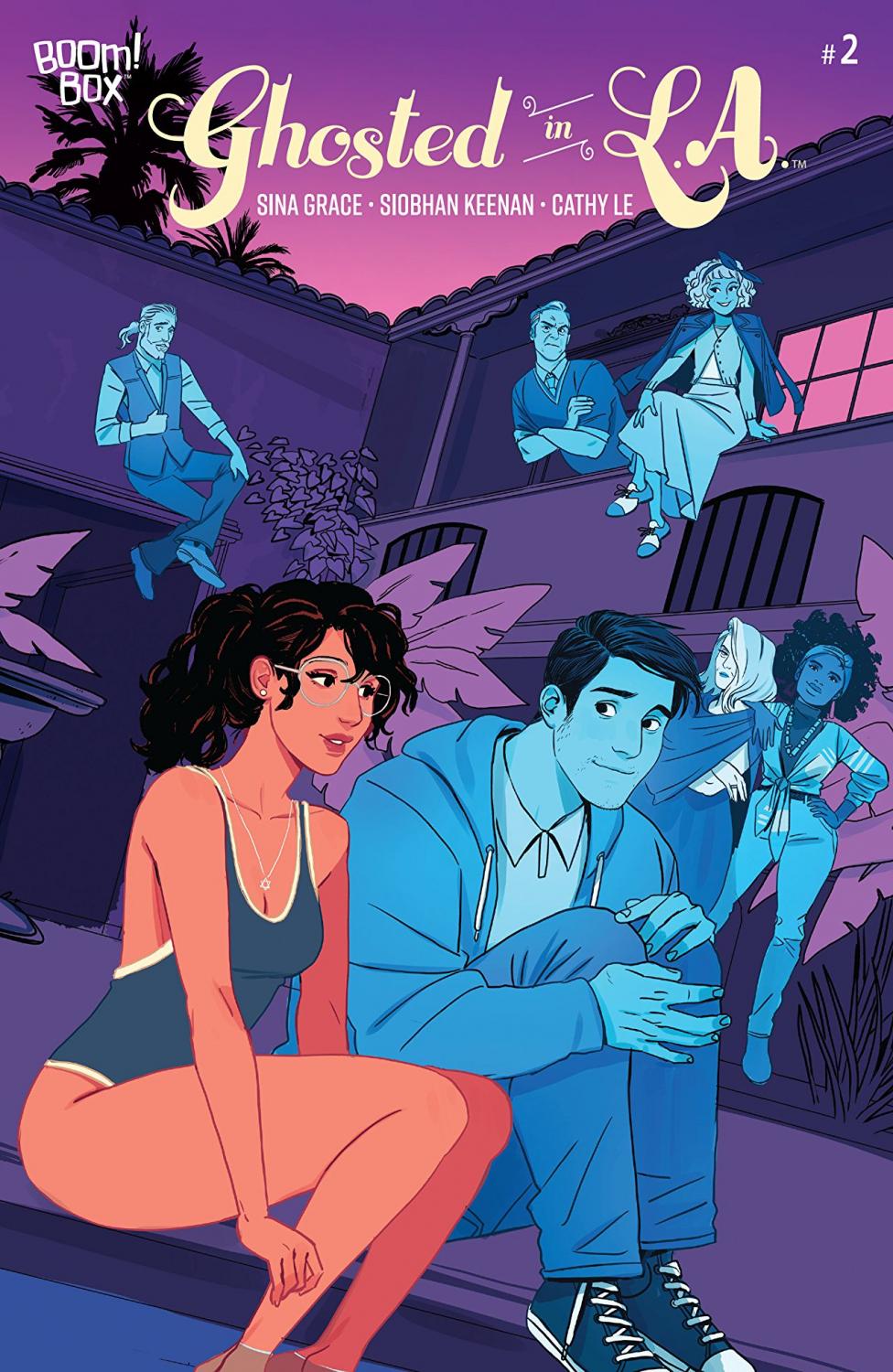
Ghosted in L.A. #2 Review
Writer: Sina Grace
Artist: Siobhan Keenan
Colorist: Cathy Le
Letterer: DC Hopkins
Publisher: Boom! Studios
Before I say that much about this issue, let me start by saying that Ghosted in L.A. is very entertaining and funny and I am excited to keep reading this series. Now that that blanket statement is out of the way, let me say that this second issue is definitely not nearly as good as the first one.
Let’s talk about the good things first. Ghosted in L.A. #2 contains the perfect amount of humor and drama that I want from a series about a young girl navigating college-aged life with a group of friends who are ghosts. Specifically, I am really enjoying the drama with Ronnie and am excited to see where that ends up going. The chemistry between Daphne and Ricky may be a little predictable but nevertheless, I am really liking it. Sina Grace is a great writer and the creation of this series shows that he can create likeable characters and amusing situations.
Siobhan Keenan’s artwork is exactly what the story needs to really come together. The whole issue is wonderful to look at because of how gorgeous every single person, place, and thing is. I may have even enjoyed this issue’s artwork better than the first, which is saying a lot because I really adored the first issue as a whole. Colorist Cathy Le and letterer DC Hopkins are also responsible for creating such incredible visuals in this second issue. The coloring in the opening flashback scene showing Agi touring the manor is awesome and I always enjoy changing color between scenes like that.
Now, let’s talk about the things that I felt made the issue weaker than the previous one. Firstly, indie comics like this one are typically what I enjoy reading apart from horror comics. However, there are things about series like this that often appear that turn me off of them pretty quickly. I’m not judging that they exist, I’m just saying that they are unappealing to me.
One of those things are the use of worn-out tropes and cliches. If you’ve read reviews of mine before, you know that I have no issue with the existence of tropes in any media. In fact, a lot of times, I celebrate them, especially when they're done in interesting ways. But there are times where those tropes are not fun or silly or entertaining and they make the issue feel a little bit weaker in my opinion. They end up almost just being annoying. There are a couple of those in this second issue.
The first one is the entire existence of the character Brint. I definitely enjoyed how Grace played a little bit with the trope by giving him such a douchey name, but he is in this issue a lot and his doucheyness is way too over-the-top and just feels like silly writing. When I read his first line "Pfft, another poser," I rolled my eyes, and not because that's an annoying thing to say, but because it is kind of annoying thing to write a douchey jock to say. Another example is the guy at the show who asks Daphne and Brint to stop dancing because they’re messing up his video of the band. This small moment is also a silly and over-the-top cliche. The last example appears when Ricky is showing Daphne his vinyl collection. He adopts the whole “I listen to indie bands, go to shows, and collect vinyl, so I’m not a cool kid” thing always bothers me when I see or read it in media. All of these things feel like classic examples of attempts to make it feel relatable to young people and failing. Unfortunately, series similar to this one make these mistakes way too often.
The appearance of these tropes in this second issue left me a little disappointed after such a strong first issue. However, the humor is still there, the entertaining drama is still there, the beautiful visuals are still there, and I’m still really enjoying it.
A Look Inside