The Further Adventures of Nick Wilson #4 Review
Writers: Eddie Gorodetsky and Britté Anchor
Artist: Ian Churchill
Colorist: Hi-Fi Colour Design
Letterer: A Larger World Studios
Publisher: Image
I have not enjoyed this series so far but I kind of want to read it to the end since it is only going to go five issues. I still have this underlying hope that I am going to enjoy the next issue, but this fourth issue didn’t do it. I should probably just give up on me liking it.
I specifically want to mention that one of the things this series is praised for the most is the originality of a story about a retired superhero. I feel like this is an interesting compliment because we have several stories in a range of media that are about a retired superhero. I will acknowledge that it isn’t the most commonly used storyline. But it is said by several famous people that I guess Eddie Gorodetsky personally knows that it is both an original story and that it is cleverly done. That makes the praise even stranger to me because this series is full of absolutely no depth. I don’t care when a comic book series isn’t deep and just silly or fun, but this isn’t one of them. There are zero things original or clever about these characters or this story.
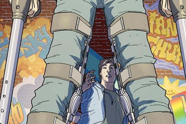
This fourth issue proves what I said above by having nothing clever, funny, or original about it. Nick is hiding from a handicapped man from his past who we learn he had saved but injured him in doing so. Yeah, Nick hangs out at a grocery store a little bit with his highschool girlfriend, but besides that, the entire issue basically only serves the purpose of telling us about a man that Nick saved who is now injured. There is not a single humorous moment in the entire issue, there is nothing exciting, and there is no major change in the storyline. This issue is as bland as the first three, and maybe even a little more.
Ian Churchill steps in for Stephen Sadowski for this issue, and his artwork isn’t that big of a difference from Sadowski’s in the first three issues, which is impressive. That still doesn’t make it great or fresh in any way. The only part of the artwork I enjoyed in this issue is the one flashback page that was illustrated like an old children’s comic, which was a fun style for a flashback.
I may not be going easy on this series but I truly believe that it is warranted. It was sold as an amazing, new, fresh, hilarious comic book series written by an award-winning television writer. It was praised for being incredibly humorous by several really funny celebrities that I personally really like. Yet, it has failed in all of those ways by not being that fresh, not being funny at all, and by just being boring. This fourth issue is yet another installment in an overhyped comic book series that will go on to be forgettable in the near future. Issue number four is truly just as boring, unfunny, and cliche as the first three. There is nothing special here and there are several amazing comic books that have come out this week. They should all be picked up and read over this issue.


