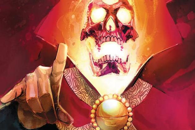
Doctor Strange: Damnation #3 Review
Writers: Donny Cates & Nick Spencer
Artist: Szymon Kudranski
Colorist: Dan Brown
Publisher: Marvel
Damnation might have been off to a strong start but now it seems like it’s merely spinning its wheels. I’m not sure how but an event only 4 issues long managed to make an issue feel like filler. The plot barely moves along dragging some awkward art with it. At least the creative team still manages to get some mileage out of the new Midnight Sons.
We left off last issue with the Midnight Son taking on the Ghost Rider possessed Avengers. With matchup like Ghost Rider vs. Black Panther and Blade vs. Thor, it’s hard to deny how fun it is. Unfortunately, it doesn’t feel as though there are many consequences with these fights and the art isn’t doing it any favors. It never feels like the blockbuster action sequence you’d imagine an event would call for. The banter between the new Midnight Sons members is still entertaining and makes for a convincing pitch for an ongoing. The fact that the book does a terrible job at juggling all these characters makes me want a separate ongoing even more.
One of the only characters to really get any focus is Wong. It’s interesting to see Wong take the role of a leader. It’s something new for the character and he clearly struggles with how to manage the responsibility. He’s written well enough that it’s convincing but he also struggles with the entire plot being on his shoulders. I’m not sure Wong can manage the title in Doctor Strange’s absence. There are hints of some grander plot that Wong is orchestrating but it’s hard to follow and seems a bit shallow. Was his plan really just to have everyone fight the Avengers while Johnny talks to Mephisto? With this issue being the penultimate issue, it doesn’t fill me with confidence.
The art this issue marked a definite step down from the previous issues. It looked rushed; completely flat and void of any life in a number of pages. There are a number of awkward figures in the book and the colors don’t help with the book at all. The colors look to wash everything out and look particularly strange in the panels with talking heads. The art lacks any weight during the fight sequence which would really hurt the book.


