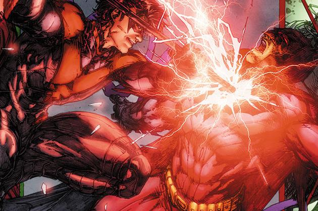
Batman/Superman #6
Writer Greg Pak Artist Brett Booth
Introduction
Batman/Superman has been a very interesting book so far. In it’s first five issues the series meshed together some great character beats that distilled Batman and Superman down to their very core. These two characters work great together in the first arc of the title. Proving that Pak has a great understanding of each hero in their adventure. Unfortunately, issue 6 fell short of some of the more interesting parts of the story, and characterization seemed off without the two having someone else to play off of. More problematic, was the artwork of Brett Booth himself, the artist felt rushed and sloppy. It was hard to look at his pencils, after getting the visual feast encompassed by Jae Lee’s work in the first arc of the book. Booth simply made no sense as a choice to continue the work here. The thin plot was a bad idea by the trickster that will serve someone else in time. At the end of the day, I expected more from Pak than the mess that was Batman/Superman #6.
Writing
The writing does not give readers much of a chance to care for the story. Most of the players in it seem sort of flat or one dimensional. Since the threat of the the videogame is introduced, Mongul does not seem imposing anymore at all. To make matters even worse, there is a resurrection in the book that seems so ham fisted and forced into the surroundings that it is hard to do anything but cringe. Even the new trickster villain is half baked and lacking most of the substance most of the substance necessary to craft a compelling villain. This tale does not have one saving grace, and it is hard to imagine that is even the same writer as the first arc in most cases. The biggest thing that feels off about the writing, is the awful narration from Superman. The character comes off as a big jerk who is barely interested in saving people.
Art
Booth once again draws the full issue in double page spreads, which is quite ambitious for any book of this nature. In many cases, the art direction makes the book harder to read, because it is so scaled back and has dialogue flowing in a horde of different ways. The art does not look any better than last issue either. The line work in this title is far too heavy, and the images feel like they are not channeling the mass amounts of energy into anything. Overall, this book feels like it is not living up to it’s full potential because of some of the lackluster work contained here.
Conclusion
Until something drastic changes this book is not worth buying. Greg Pak is doing great work in some of the other places in the DC Universe, but lacks direction here. Brett Booth’s art does not make sense to me in the context of this title. Avoid this issue.


