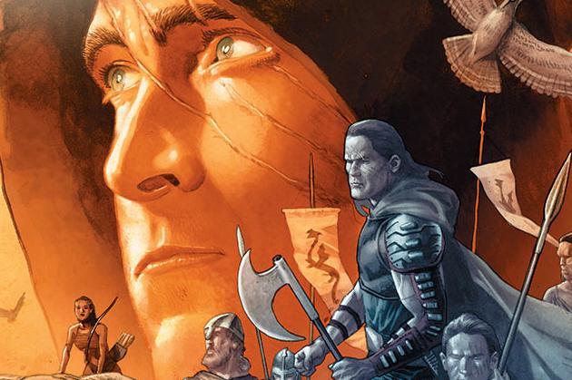
Eternal Warrior #3
The Eternal Warrior is but one comic featuring the rise of Greg Pak. Action Comics #25 was a massive victory leap for the writer showing that he is capable more than anyone could have ever thought possible. With many of his titles from the past couple of years, the scribe has thrived on taking expectations of readers, and twisting them beyond the point of recognition. The Eternal Warrior may not be the best known character in modern superhero comics, but he does have a few ground rules that writers are implicitly meant to follow. For instance, the character is probably not going to die. Therefore like most individuals Pak’s hands are tied with so many rules or regulations, that he should not logically be able to do inherently interesting things to the character, yet he still finds a way to craft greatness from a story. The hook of the man living an eternity without aging, while having a daughter just like him who retains the same age, is indeed tragic. Making the character a man who does not want to fight anymore gives readers yet another hook into this fascinating story.
The art in the book really steps on the writing in many aspects. An issue full of talking heads needs someone that really knows what they are doing. With that in mind, the plot in this issue is kind of sparse, and will make readers slightly unenthusiastic for the book in general. Fortunately, the book is going to radically change with issue 5 bringing in the future-verse. However until then, Pak should be able to deliver a script that is more engaging than this mundane yarn. The backstory of Xaran is far from interesting, and did not add anything to the character. The overall plot this book is so exceedingly thing, that it is almost a shock that Valiant sent the script out of the door. Scenes with The Eternal Warrior and his daughter add nothing new or interesting in the Pak sensibilities that readers have grown to love from the writer. This could be a case of editorial not letting him examine the further reaches of the character until the future came into the question, or perhaps he is just seeding a larger arc into the title.
The art on this issue is kind of a mess with three different pencillers contributing to the visuals. Trevor Hairsine does not look like he has been up to par with the standards of the last couple instalments. The illustrator has a few good pages, but overall looks shockingly inconsistent. Line work is noticeable sloppy in these pages, in ways the the artist seemed to perfecting with more time allotted to him. Diego Bernard provides some back up pencils on the flashbacks to this issue that are pretty stunning. The artist has a great style that is remarkably clean, and frankly makes Hairsine look even worse. His pages are packed to the brim with interesting content, and some fast moving kinetic energy that gets readers instantly excited. The page layouts are dynamic, and so it the artist’s acute sense of storytelling. It will be fascinating when the penciller takes over the book
This offering by Pak and Hairsine seeds something interesting, but fails to deliver where it really counts. Diego Bernard really knocks his art pages out of the water, and steals the entire issue.


