Sidekick #1
The Team
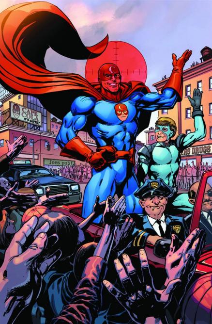
Writer John Michael Straczynski Artist Tom Mandrake
Sidekick is a new series with a concept that seems to be explored better in other places, Insufferable is hitting this same topic in a direct way. That story definitely detracts from this one, yet also tells a more nuanced tale in its first chapter then this story. This comic reads really pessimistically from Straczynski, a writer that is not a stranger to darkness in the space of modern comic books. In this modern society we need more than the fall of a main character in order to be attracted to a story. There is no subtlety here, and the title ends up really hurting for that exact reason. The main character is in a vicious circle of events that just do not add up to a whole. In the back of this issue Straczynski even states that he does indeed hate Sidekicks. Is the point of this book to just simply torture the main character?
A negative outlook on some of the older Sidekicks is an interesting idea to explore, but is not interesting enough for an ongoing series. In a first issue a certain amount of ground has to be explored in order to get the reader hooked into a series. While not everything in the world can be explored in the first issue, there should be some hooks to get the reader interested in the next issue. There is no clearly defined text to get the reader interested in the main character. Not enough sympathy can be restored from a character that we have never met simply falling from grace.
Artist Tom Mandrake does an okay job in the series setting up the visual palette. The artist has a scratchy style that takes away from the storytelling in the issue at times. The two leads in this title also look very similar, which was a horrible visual choice. The harsh lines go well with the tone of the book, but may make readers want to close their eyes. This is a far cry from the house styles of Marvel or DC, but is still a bold visual decision. Characters look too stiff in this title, in many cases the illusion of movement is absent. This is a shame as the issue could have flowed a lot better in the hands of a different artist. HiFi’s colors also seem to washed out in most cases of the title. People in the book seem to dark in the majority of the scenes.
In closing Sidekick #1 reads like a hate letter to the superheroes best friend. This approach is horrible depressing, but also does not teach the reader anything. Stories with people falling from grace go completely against what comic books are made for. While people like Alan Moore have deconstructed the superhero, it is done so in a poetic way that embraces the different facets of the medium. This could be a dull television script or a bad comic book, it will fail to impress under any circumstance. There are a lot more comics that deserve your attention as compared to this underwhelmingly sadistic first issue.
A Look Inside


Comments