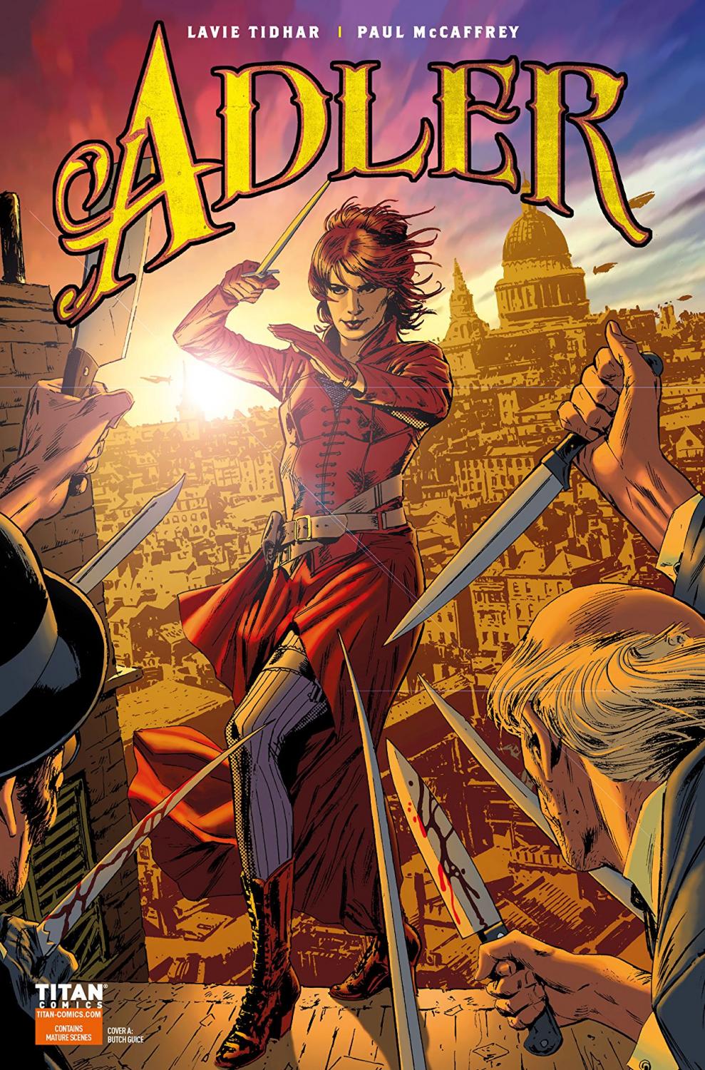
Adler #1 Review
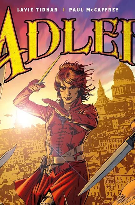
Written by: Lavie Tidhar
Art and colors by: Paul McCaffrey
Lettered by: Simon Bowland
Published by: Titan Comics
Irene Adler, the woman who beat Sherlock Holmes, is starring in her own comic. Joining her is an eclectic cast of famous females from fiction and history. The adventure is starting, the comic has commenced, and the game’s afoot.
Having Jane Eyre be our introduction into this world was a brilliant choice. Given that the book is going to be filled with larger than life personalities, she gets to be the reader’s rock. And as she makes her way back into society the environment is just as new to her as it is to the reader. When she meets up with her prospective flatmate, Irene Adler, another piece of the narrative’s brilliance became apparent. The classic pairing of Dr. John Watson and Sherlock Holmes is nicely channeled by the pairing of nurse Jane Eyre and Irene Adler. The two have skills and personalities exclusive to them similar to Holmes and Watson. And, along the way, more characters will join with even more dynamics to add and explore. This gives the story a flair akin to the League of Extraordinary Gentlemen, especially with the focus on literary characters.
While this introductory story was just that, an introduction, it had a palpable promise to it. The story was handled well. The characters were set-up to be interesting and more than one-dimensional archetypes. The story had a coherent nature and was scripted well to reveal certain elements and pique interest. And, I liked the dialogue’s “dry” literary feeling to it. The version of Professor Moriarty presented in this issue was an interesting take on the character and felt like a formidable enemy. I look forward to seeing this world develop and the promised additions already seem like they're destined to make this story unique.
How can art look literary? I don’t know the answer to that question, but I will say, that is the word I’d use to describe the art in this comic. Something about it feels historical and it has an air of literature to it. The lines and how they’re used for detail remind me of French comics or “Bande dessinée” art. (I hate to invoke this name, but some of the most lucid works of Moebius use this line style) And, the general design of everything has an established atmosphere to it. The coloring and warm palette also help with this “historical” feeling I get from the art.
All in all, Adler #1 is a good start to this story. It introduces its elements and knows how to use them, but not enough is included to get a full understanding of what we exactly have yet. The way all the pieces are put into place gives the sense that there is more here than can be gleaned from this short issue, but time will be the judge of that.
A Look Inside