Strikeforce #2 Review
Written by: Tini Howard
Art by: Germán Peralta
Colors by: Miroslav Mrva
Lettered by: Joe Sabino
Published by: Marvel Comics
Blade and his team chase down the Vridai in Vegas. After killing the real Daimon Hellstrom, they track his doppelganger to his sister’s club. The issue is action-packed and has brief glimpses of character development, but it wasn’t until the end that it felt like the story could be getting a more focused objective.
Strikeforce, as a series, is an interesting animal. It calls itself more of a “horror” comic, but other than the atmosphere I don’t find that to be the case. It has a distinctly less “superhero” feel to it and that is a strength for the story it is creating. The “strikeforce” is made up of an eclectic group of Marvel characters. But there isn’t a feeling of the cliché makeshift grouping drama or tension between the characters. They know why they must be the ones to do this mission and we can forgo the often-boring conflicts that arise from these pairings. There is also a great explanation for the question, “Why can’t the Avengers just take out this threat?”
There seems to be some relevancy to the members chosen in the story. Blade has always dealt with the dark and supernatural, and this threat specifically. Angela has a personal connection to the events that led to this happening. And the most intriguing motivation, in my mind, is that of Bucky Barnes. He has a history of having his visage used to do terrible things and it happening again gives him added drive to want to see this mission completed. However, the rest of the characters have yet to be explained in the narrative why they, as opposed to any other Marvel hero, was picked for this story. Writer Tini Howard has said that there is, in fact, a reason for each member being here and with this only being the second issue I can’t say that is wrong. She has crafted a solid story so far, one that feels outside a normal Marvel superhero story. But the themes of trust she talked about exploring have yet to develop in any substantial way.I really enjoyed the classic shapeshifter vs real person, "Shoot them, not me," dilemma that was ended before it got stale and in a great way.
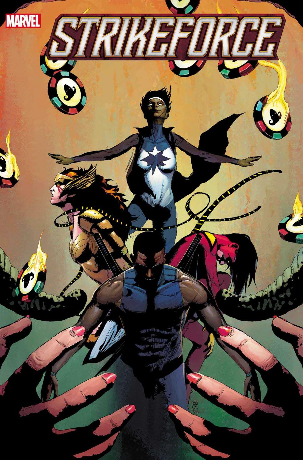
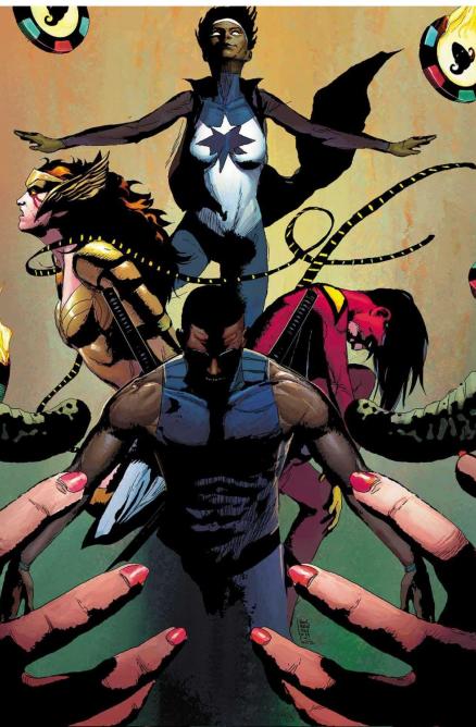
The art is what really sets this series apart. The dark atmosphere of Germán Peralta’s art with Miroslav Mrva’s colors is what keeps the tone unique. The art of characters and scenery alike is nicely detailed and framed. And the brushed colors and chosen palate is able to get the right amount of grit out of the art while also using differences in tone to indicate shadows and light subtlety. The change of clothes the characters experienced in this issue also helped highlight just how good the art is. And, the covers by Andrea Sorrentino and Dean White have been able to capture the bests of this series’ distinct mood.
This was a solid second issue that continues the adventure of the #1, but it needs to get a clear direction. The art is spectacular and is carrying the atmosphere and keeping it from feeling like a stale team-up title. With the cliffhanger, perhaps the story will start to pick up. Especially given who graces the cover of the appropriately named next issue, DOOM.
A Look Inside