Aquaman #47 Review
Written by Kelly Sue DeConnick
Art by Robson Rocha
Inking by Daniel Henriques
Colouring by Sunny Gho
Lettering by Clayton Cowles
The first arc of this new era of Aquaman ends with this issue, and I must say overall it's been uneven. I enjoyed the last two issues because the team went all-out with their new mythology and Robson Rocha put out the best work of his career, which he continues to do even with this issue.
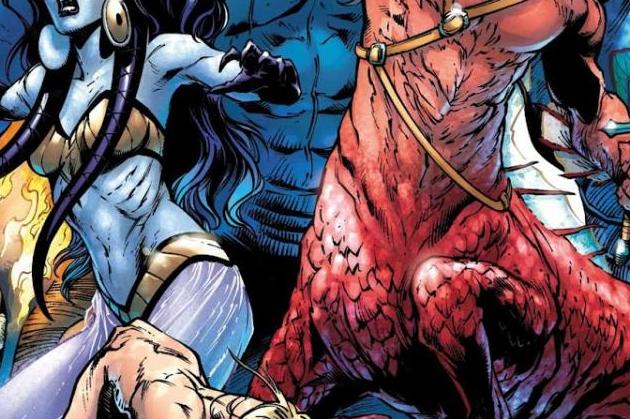
Rocha, along with inker Daniel Henriques and colourist Sunny Gho, have found a rhythm that culminates with this issue. This book looks gorgeous, and it's the most action-packed entry in the arc. Gho's colouring in particular feels less muted than it has in the past, with bright reds and greens making their presence known as the book moved along. I suspect it has more to do with story than it has to do with craft, but Gho steals the show here. There's sharp, emotional weight to these pages and Rocha and Henriques continue to work wonderfully together. There are a decent amount of brand-new characters on display and Rocha's sense of design comes across very strongly. They all look unique and Gho's contribution to these characters is also very noticeable, in that they each have an interesting colour palette.
Kelly Sue DeConnick was an interesting choice to bring aboard and reinvent Aquaman. This story felt original and tying the character to a new mythology that we've never heard of before is a good enough way to make the character feel a little fresh, but five issues in I still can't help but feel a little lost as to the general direction of the character. I'm sure you're going to hear about his new tattoos quite a bit online when you read this, and this comes across to me as a poor way to tie into the film's depiction of the character. I thought DC had moved past this unnecessary synergy, but I don't know if this was a higher-up decision or not. Regardless, it's poor aesthetically, despite Rocha's strong sense of design.
This issue was a decent conclusion but I still feel a little lost when it comes to this new direction. It feels both new and exciting, while also feeling unnecessarily synergistic. The art is incredible and a joy to behold.


