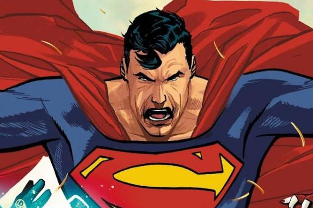
Heroes in Crisis #7 Review
Written by Tom King
Art by Clay Mann, Travis Moore, and Jorge Fornes
Colouring by Tomeu Morey
Lettering by Clayton Cowles
The various plot threads that Tom King has established throughout the series are beginning to come together and make a bit more sense, but there is a frustrating lack of true cohesion and satisfactory characterisation that further distances me from this story.
With the presence of more than one artist on any given title, there's an expectation that the plot would be accurately divided among the artists in order to provide an aesthetic reason for multiple artists. Here, the comic reads to me as if King wrote this with three artists in mind. The issue is divided into three different scenes that constantly cut back to each other. The section of the book by Jorge Fornes doesn't seem entirely necessary when taken in context with the whole book, and reads like an attempt by King to add some humour in an already "humorous" book. Colourist Tomeu Morey does a pretty nice job at evening out all three styles to make the scene transitions a bit more seamless. Unfortunately, there isn't much substance to the storytelling. I'm a fan of all three of these line artists, Jorge Fornes and Travis Moore specifically, but there's a lack of emotion and depth to what they're depicting and none of their flair can save this story from Tom King's script. Mann is a good artist but his attempt to complement the story with his hyper-detailed female forms just isn't doing it for me.
King expects the reader to roll with his characterisations despite them not being accurate or true in any way. This is King's forte, as he tries to make the characters seem more human by peppering filler words such as the word "like" in an attempt to humanise them, or make their speech sound more relatable to us, we lowly mortals who happen to share the same dialogue patterns as heroes like Blue Beetle or Booster Gold. There's an inherent disconnect to this, and this is beside the fact that there isn't a single compelling aspect to this plot, or rather this entire series. It seems to me that King has lost the point he was trying to make. In what seemed to be a different take on the DCU, where mental health was something that the Trinity was concerned with, is now this comedy caper where all the characters are wacky and dumb, and oh how will they get out of this one? In what looked like a genuine desire to explore mental health in a superhero universe, the greatest takeaway I've gotten from the book is that this is what happens when Tom King tries to be funny. It just isn't successful humour.
I'm sure there's an audience for this book but it isn't clicking for me in any way. The art is visually pleasing but it doesn't do much in the way of storytelling or accurately delivering on what the plot is. It's painfully unfunny and very clunky.


