Heroes in Crisis #6 Review
Written by Tom King
Art by Clay Mann and Mitch Gerads
Colouring by Mitch Gerads and Tomeu Morey
Lettering by Clayton Cowles
The first thing I'd like to point out about this book is that another artist has joined the fold. Mitch Gerads is Tom King's most lauded collaborator. He also happens to be the fourth artist to have drawn this book. This probably isn't anyone's fault other than the editorial department, since I believe this story has gone through some changes since it was first announced, and possibly since the first issue debuted. Gerads manages to infuse his style while also keeping the visuals consistent with Clay Mann and Tomeu Morey's work, which also appears here for two bookending pages.
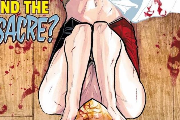
Gerads does some beautiful work here. He makes excellent use of negative space, which highlights both the beauty and the trauma of each hero's simulation. There are a lot more splash pages than I'm used to seeing in a Mitch Gerads comic so at least King is giving him the space to do different things with a page after the locked grids of MISTER MIRACLE. Normally his figure work is less than perfect since he and King tend to focus on the less flattering aspects of the heroes they depict. Here his take on the characters is a little more traditional, with his Poison Ivy in particular looking very traditional. Gerads also seems to step into an entirely different world, as he recreates a panel from REBIRTH #1, which interesting me because I never lump Gerads into any of the traditional, explosive superhero artists working for DC. Some of these pages signify a big step in his style and career and they're fascinating to look at.
Onto the plot. This was just horrendous from a plotting perspective. Nothing is done to advance the story in the slightest. This is essentially a flashback issue so whatever momentum the last issue had with me is gone. King focuses on Harley Quinn's relationship with Poison Ivy, Wally West's struggle with his family, and, of course, Gnaark's ongoing battle with living in a world that doesn't fit with his standard of life as a caveman. Because that's exactly what this story needed.
King tends to focus on these lower-tier, strange characters, and he does this in order to mine some sort of humour out of it, as well as to display whatever knowledge he has of the DC universe at large. It's not hard for a reader to read this, or anything involving Kite Man, and silently commend King for deciding to expand on such a weird character. Thus, it's hard for me to see Gnaark's scenes as anything more than a display of humour or knowledge, despite the lack of appropriateness the former has in this story.
King's thesis on Wally is that everybody was so glad to have him back in the world, that hope has returned and everything is good. Wally doesn't think so, however, since he misses his family. This interpretation displays a fundamental misunderstanding of what actually happened, which is that Wally wasn't aware he had a family at all. He learned about their existence very recently, so I'm not entirely convinced that he would take issue with everyone's reaction of his return since he didn't even know he had a family.
The amount of words in this issue is kind of inexcusable. Covering beautiful splash pages with an absurd amount of word balloons is so anti-King given how sparse a lot of his books can be. Having Gnaark quote Keats, though, is on a different level of pretentious out-of-character work that is a common thread found in a lot of King's writing.
The Prognosis:
Gerads' art is amazing, as he stretches his artistic muscles and works his pages in a way that I haven't seen him do perhaps since his PUNISHER run. His figure-work and colouring is amazing. It can he hampered by an extraordinary amount of works, which is uncharacteristic of King's usual writing style. Does spending a vast amount of time reading a single page constitute as a bang for your buck?


