Justice League of America Annual #1
Writer: Steve Orlando
Artist: Kelley Jones
Colourist: Michelle Madsen
Letterer: Josh Reed
Art. Shit. Environments look nice, but everything else…
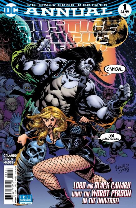
Lobo doesn't look bad, but Canary…
As far as Annuals go, this is the worst example. While I prefer single over-sized stories in an Annual, the worse offence these issues can do is be boring, and that's exactly what this issue is. It's mind-bafflingly boring on an Earth-shattering scale that this series has not yet seen.
Steve Orlando is something else. I hate to have to trash someone but this man isn't delivering serviceable content. Want one line of dialogue from this mess? Here you go: "Using local dolphin folklore, star charts and satellite projections, Aquaman and I traced the planet's likely location." I admit, this can be taken out of context, but this sentence is about space dolphins. The first few pages of this issue was so badly paced and have nothing to do with the story at hand. Why would Lobo be referencing JUSTICE LEAGUE VS. SUICIDE SQUAD when asking Black Canary to accompany him on his space dolphin romp? A cosmic story like this should be fun, and fun this isn't.
The artwork is by Kelley Jones, who is an absolutely legendary artist. While unrefined at points, Jones' art surprisingly picks up at the end of the issue, which is perhaps due to the lack of Black Canary since he makes her look like some sort of clay-person. His take on Lobo and another character who shows up isn't half bad at all, and actually fits with the characters' personalities as well as the weird situation. Still, it mostly unsatisfied me.
Orlando somehow wrote one of the worst issues of the series here. The story is overlong, boring, and took a lot more time than it needed to get started. Jones' artwork is mostly unsatisfactory though there are some bright spots here and there.
A Look Inside