The Amazing Spider-Man #45 Review
Writer: Nick Spencer
Penciler: Mark Bagley
Inkers: John Dell with Andy Ownes
Colorist: David Curiel
Letterer: VC’s Joe Caramagna
Publisher: Marvel Comics
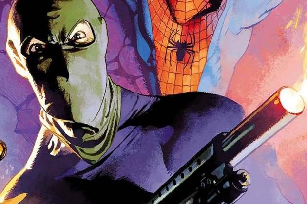
Amazing Spider-Man #45 officially kicks off what is probably the biggest story in Spencer’s run since Hunted, and it starts off similarly strong. These feel like the stories that he has wanted to be doing this whole time, and a lot of the other stuff is just a detour. There’s not too much to spoil here; Spider-Man has his first confrontation with the newly revived Sin-Eater. It feels focused, and thanks to some call-backs to Peter David’s the Death of Jean DeWolff, it also already feels like it has stakes. That’s very important when you consider how many things have been drawn out in the run so far. If I have some gripes with the writing, I think it’s weird that Spider-Man quickly accepts certain things (and I’m not talking about Sin-Eater’s revival). Aside from that, this is without a doubt some of the higher quality Spider-Man stuff from Spencer. It’s not one of his comedic issues, of course, but this is an excellent reminder that that’s not all he’s good at.
Spider-Man legend Mark Bagley takes the reigns for this chapter. I sometimes forgot, though. I’m not sure who to credit for it, but some pages don’t really look like Bagley’s style. Specifically in the faces. That’s not to say they look bad. They just look different and I thought it was worth noting. Anyway, I really liked Bagley’s paneling in some scenes. There’s one where Spider-Man’s leg sticks out of the next panel to lead your eye into it. Good stuff. I think some of the characters look older than they’re supposed to be and that through me off in a few cases. Curiel’s colors are surprisingly vibrant for such a serious issue, but they don’t clash with the tone. I appreciate that he’s not afraid to embrace Spider-Man’s stark red and blue rather than dull it down in an attempt to make things seem more serious. The settings give him good chances to do something interesting with the lighting, and he pulls it off in each one.
If you’ve been counting the days till the Sin-Eater’s return, you won’t be disappointed. This is a really solid start to this story. I’m a little hesitant to see how the whole thing plays out, but this is an excellent reminder that Spencer knows how to set the stage when things get serious, too. Bagley’s art is great as ever, and the setting means that he and Curiel get to do great things with the environment in each panel.


