The Amazing Spider-Man #20.HU Review
Writer: Ncik Spencer
Penciler: Cory Smith
Inker: Mark Morales
Colorist: Erick Arciniega
Letterer: VC’s Joe Caramagna
Publisher: Marvel Comics
Remember how I gave all the HU issues so far full recommendation? That was fun while it lasted. Don’t get me wrong, this one’s not bad by any means. It just lacks the emotion that previous ones carried. It makes sense. We can all get behind the plight of Black Cat, Gibbon, and the Lizard. The Vulture, on the other hand, isn’t the kind of guy to go tugging on my heart strings. You probably should still pick this one up, if only because of all the important plot points, but just remember not to expect the same insight that you got before. This one doesn’t really teach us anything about its central character that we didn’t already know. It’s really the Vulture simply doing his usual thing in the given predicament. The aforementioned plot developments are at least effective in mixing things up, but ultimately, I think they will only lead to more of what the story has already given us.
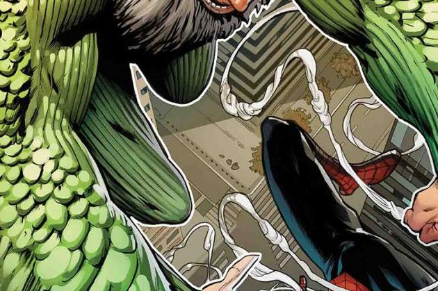
The art in the B issues of Hunted is still better than that of the main series. It’s a shame, but the point of this review isn’t to rag on another book. Cory Smith’s pencils are probably the most cut and dry in terms of style when compared to his HU colleges. The shot composition is effective, and he and inker Mark Morales excel when it comes to communicating with visuals – show, don’t tell. There’s a lot to be learned just from a single panel featuring nothing but Adrian Toomes’s smug mug. Erick Arciniega’s coloring really shines when you see how mindful he is of the lighting in an environment. Tyler Crook’s art for the backup story is at first a little too cartoonish for the tone that the script is going for, but then you see that it has a sinister kind of twist to it that works in its favor. Jim Campbell’s colors, much like Arciniega’s, are mindful of the lighting in a less literal way. He makes the setting so dark, it does make you feel sorry for the central character.
If it didn’t carry information that’s clearly going to be crucial to the coming issues of Amazing Spider-Man, this one would probably get a pass from me. It lacks the pathos that made the other HU entries such engaging reads. It’s not bad by any stretch of the imagination. It just doesn’t do anything too interesting with its content. Pick it up if you’ve been following Hunted. Just don’t expect to be blown away.


