The Amazing Spider-Man #16 Review
Writer: Nick Spencer
Pencilers: Ryan Ottley & Alberto Alburquerque
Inkers: Cliff Rathburn & Alberto Alburquerque
Colorists: Laura Martin, Brian Reber, and Carlos Lopez
Publisher: Marvel Comics
Finally, Spencer’s first big story on Spider-Man. We all know that what he’s really building to is creepy centipede guy, but this is sure to be the most important story in the series so far. It mostly starts off how we all expected, but throws a curveball that will get people talking.
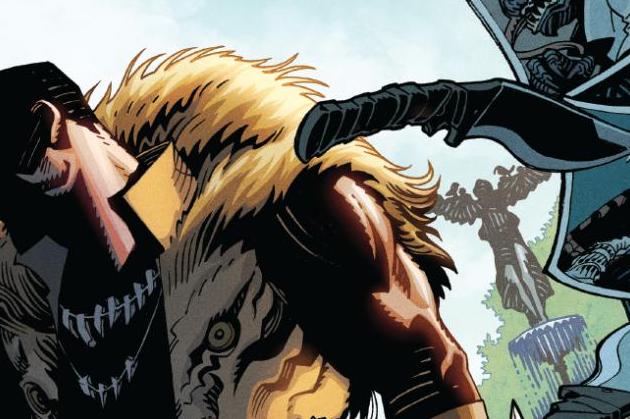
Like the fact that Kraven had 87 cloned children. Normally, I would consider that a spoiler and give you a warning, but they’re introduced and killed off panel in just a few pages. It does feel a little jarring, and I think most people would agree that the introduction to Kraven’s remaining son (who doesn’t seem to have a name, unless I completely missed it) should have been more gradual. Still, the 3/4s of the issue dedicated to Kraven are intriguing, finally showing us a little bit more about what he’s doing differently this time but still leaving us with some questions for later. The other quarter, dedicated to Billy Connors, goes exactly like you thought it would. That’s not a bad thing, though. Actually, the events leading up to it made it a lot easier to care when it hits the fan, beyond just super-hero-needs-to-do-good-thing. We understand why Spider-Man feels guilty here specifically. And Peter just putting on his costume while MJ tells him all the reasons it doesn’t make sense for him to go? You’ve got to love moments like that.
So, the art. It’s no secret that I’m not the biggest fan of Ryan Ottley’s work, but I’m reading Invincible right now for the first time, and it’s given me some new perspective. Maybe it’s just made me appreciate certain characteristics of it, but it’s grown on me. Then again, it kind of looks completely different. He puts more detail into everything, but I think less is more when it comes to Ottley’s faces. They can be so ugly, and his lines overall are so angular and janky now. It’s just weird to read Invincible and think, “yeah, I can see why people dig this”, and then backpedal when I see this. Alberto Alberquerque’s are contrastingly loose. The faces can be a little weird, but they never pulled me out of it and I still thought they did a good job of communicating to the reader. I don’t have too much to say about the coloring except that it’s great in the last quarter of the book. Really turns up the anxiety from all perspectives of the situation.
A solid start to a story that I hope will live up to the hype. It’s not without its flaws, but I think anyone who picks this up will be satisfied and on board for the next issue. Decent artwork, elevating colors, and an excellent setting for Spidey make me excited for what’s to come. Check it out.


