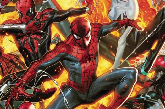
Spider-Geddon #1 Review
Writer: Christos Gage
Artist: Jorge Molina
Colorist: David Curiel
Publisher: Marvel Comics
Oh, man. Spider-Verse was the first major comic book event I ever read, so I’ve got a bit of a soft spot for it. I don’t know that I was clamoring for a sequel, though. I love me some Christos Gage, however, and we’ve got Superior Spider-Man back into the mix just in time for him to screw things up for everyone again. So who knows, maybe this will be fun?
I admit, I was skeptical of Spider-geddon for a while, and still am not wholly convinced. But this issue did well in alleviating my fears that this sequel was a cash grab and wouldn’t do enough to justify its existence. A different protagonist is a good way to prove me wrong, and the pacing felt perfect for an intro issue. We spend just enough time assembling our team of heroes and reintroducing our villains. If this keeps up, I won’t be able to recommend a pass on a single issue of this story. Gage of course writes a great Otto Octavius, being just a little creepy and shamelessly arrogant. We can’t wait for him to ditch that ugly Superior Octopus get up and get back to the Superior Spider-Man we know and love. She doesn’t get a whole lot of room to show her personality, but Spider-Gwen is kind of just written as a female Peter, and I am so sad to see that it looks like everybody is going to ignore that she has a symbiote going forward. I really loved what Latour did with their relationship at the end of his run and I would hate to see it just swept under the rug.
Jorge Molina’s action sequences are exciting thanks to a good variety in panel layout and perspective. He really keeps things fresh throughout, and puts emphasis one both Otto and the Inheritors creepy demeanor with slanting but confident body language and posture. They feel like a serious threat. I’m a big fan of what David Curiel has done with the colors in this one. A fight in the dark of the Auto Empire could easily be presented as boring and lifeless, but instead it’s full of energy. The background is usually dropped in favor of lighting to put the focus on the tone of a given moment. These two really put their best together to make the visuals feel cohesive and always engaging.
So far, I think I like this more than Spider-Verse. The first issue gets the ball rolling quickly, so it feels very much worth your time and money. Spider-Gwen fans like myself may be disappointed, but everyone else is in character. Molina and Curiel craft an exciting, fun world in a time of serious potential for tragedy. If you’re a fan of Spider-Verse, check it out.


