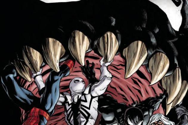
The Amazing Spider-Man Venom Inc. Omega #1
Writers: Dan Slott & Mike Costa
Artists: Ryan Stegman & Gerardo Sandoval
Colorist: Brian Reber
Publisher: Marvel Comics
I’m not really sure what I just read.
Well, if there’s one way I can summarize Venom Inc. as a whole, it’s wasted potential. I’ve talked a little bit in a previous review for Venom about what my hopes were for this crossover, but I came to accept that those hopes would not be realized pretty early on and made peace with it. So this story isn’t going to have any sort of emotional depth and address what these characters are going through mentally. Okay, no big deal. We’ve still got a team of really cool heroes and anti-heroes working together, fighting hordes of super-powered criminals made even more super by alien goo. Should be fun, right? I guess?
Spoilers to follow.
First off, the dialogue in this issue feels stilted and unnatural. Our heroes do not have the upper hand, yet, in a way that doesn’t seem like it’s intentional and played for laughs, most of what they say makes it feel like they’re calm and unconcerned. Common phrases tend to switch out words that make them feel like something nobody actually says. This is strange because Dan Slott and Mike Costa have been writing the whole thing, but I didn’t have this problem with previous issues. This has been present a little bit, but now they seem to really be pushing a “thank you for your service” Spidey. He goes out of his way to get patriotic with Flash and it feels forced. The turn-around in which they gain the upper hand feels way too convenient. Maniac’s symbiote pieces apparently leave an immunity to them when their control is first broken. Spidey uses this to power up Flash, making him even more toxic to symbiotes, I guess? I’m not sure why this is necessary. The only reason Anti-Venom didn’t work before is because he didn’t get a chance to touch him. Sidelining Flash and then making him stronger feels like a not so subtle way to drag things out.
As for looks, this issue gave me the impression that there may have been a lack of communication. Venom #160 ended with Price looking about the same height as Venom, maybe a little bigger, but with guns poking out of his shoulders. Honestly, I didn’t expect it and I was looking forward to seeing what kind of challenge he could give the team. Ryan Stegman’s version, however, is just an inflated Venom. I thought the cover of this issue was supposed to be symbolic, but that’s actually how Maniac is compared to the rest. Oh, and he’s got a few spikes on his back… It’s fine on its own but ironically underwhelming when you remember what we were shown at the end of the last issue. The last five pages are done by Gerardo Sandoval, and while I was praising his improvements last issue, I feel like there’s been a step back here. An angry, yelling Mockingbird just looks mildly annoyed. Characters can’t really be differentiated by their faces. Everyone is so angular and blocky. I really, really don’t like his Peter Parker. I will commend colorist Brian Reber’s efforts here. He does a great job of setting a tone for calmer moments with cool lighting and climaxes with a mix off blues, grays, and red. It’s a weird combination but it does fit the setting well. Andi’s hell fire is also a standout. It can be mesmerizing to look at.
I think it’s safe to say that for me, this crossover was a dud. We didn’t get answers for most of our questions, and the ones we did didn’t feel well thought out. This one is all style and very little substance, which is fine for some, but I know will leave many fans of Eddie and Flash disappointed. If you’ve come this far, check out the last issue, but if you’re thinking of looking at the whole story, I wouldn’t bother. Go read Rick Remender’s Venom instead.


