The Wicked + The Divine: 1831

Writer: Kieron Gillen
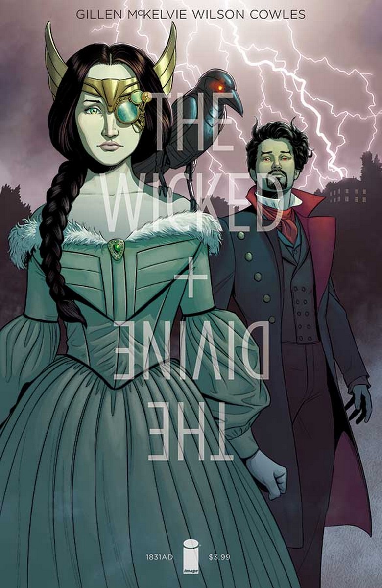
Artist: Stephanie Hans
Letterer: Clayton Cowles
Publisher: Image
The Wicked + The Divine 1831 retells the creation of Frankenstein, with Woden as Mary Shelley, Lord Byron as Shelley, and Ananke as Ananke. I guessed at some of the real-life counterparts for the other members of the 1831 pantheon, but I don't want to venture a guess and be wrong, I was never been into gothic fiction that much so my knowledge of it isn't as deep. Anyways, this one-shot fills out some of the blanks in the world of WicDiv a bit more, which makes it a very intriguing read.
Gillen goes back to themes that are present in a lot of his work in this one-shot. I have to admit that for all the thick subtext that's always present in Gillen's books, my engagement with them is always more superficial than it should be. I connect so immediately with the characterization in this series, to name one example, that I rarely try to really break down all the complex things that Gillen is saying about youth and art and whatnot. Which is strange because that's almost the opposite of the way I relate to most fiction but it doesn't stop me from really enjoying The Wicked + The Divine in my own little way.
The WicDiv team have always brought on a lot of wonderful artists from Tula Lotay, who drew what might be my favorite issue of the series, to Brandon Graham to designer Hannah Donovan. Stephanie Hans, who previously created issue #15 (the one with Amaterasu), does the art here. It's a totally unique style for comics as she uses oil paintings (or something that looks like oil paintings, I can't say for sure, art is weird). The colors are significantly colder here than on that one, but Hans' work remain very impressive.
Compared to Hans' last issue for WicDiv, there is more actual text on the page here. Cowles uses a font different to his usual one that blends in more with the style of the book, so the text never clutters the art too much. I have to say that as much as I can appreciate the art here, it is a bit too formalist for my taste if that makes sense. At the same time, I really love Hans' palette in the more abstract panels.
This one-shot is astonishingly well-crafted but it isn't what I usually expect from the series so I feel like I didn't fully grasp it. That's on me, though. I still enjoyed it but I recognize that there a lot of layers here and that I'll end up revisiting it in the future.
A Look Inside