Heartthrob #1
An honest, intriguing look at how and why people change
HEARTTHROB #1
Writer – Christopher Sebela
Artist – Robert Wilson IV
Colors – Nick Filardi
Publisher – Oni Press
Callie has a new heart – and a whole slew of other problems including a mysterious lover in this honest, compellingly written and intriguing ‘70s love meets heist story from Sebela, Wilson and Filardi.
I’m not sure if I’ve ever put this into writing but I’ve always thought it so let’s get it out of the way now and forevermore: Christopher Sebela knows how to write people and write them well, flaws and all. It was true in Welcome Back and High Crimes and it’s just as true here.
I won’t do much in terms of explaining the plot here, as I think it’s better laid out in this emotionally raw, funny and deceptively complex first issue than I could ever capture, but suffice to say it’s good and built upon a strong foundation of loose ends and deception met with strong-headedness and a desire for real change that I’m eager to see followed-up on.
As Callie transitions seamlessly through her heartbreak (and transplant), anger, frustration and more here – across dialogue and narration alike – she feels like a real, scared and defiant person, something removed from simply a character, the thoughts and feelings of a real person, perhaps from experience, perhaps an amalgamation of people that Sebela has come across, laid out here.
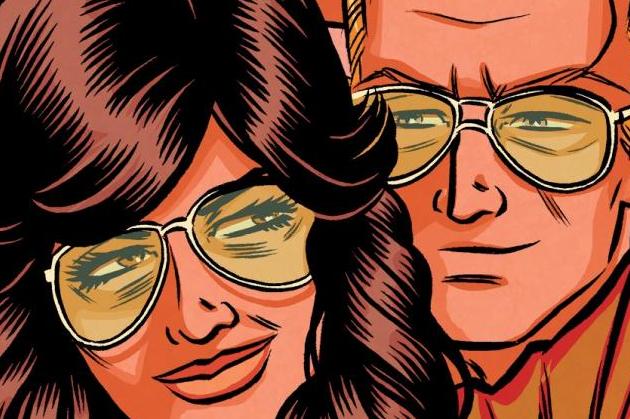
Wilson’s art – equally expressive and honest – does a great job of conveying the character’s emotions and Filardi’s colors evoke that tinged, nostalgic and strange ‘70s palate. However, the characters, beautifully depicted, do feel somewhat removed from the environment, like they’re sitting on top of it in a way. It’s jarring but not so much so that it detracts from everything else that’s at play here. Ultimately it’s a decent looking issue that’s expressive and in keeping with the feel and tones of the time period it’s meant to depict but has some creative decisions in terms of aesthetic - particullarly in interplay between characters and environment - that seem like a misstep.
This is an honest, emotional first issue with a twist that will probably make or break it for readers but works for me. The team here is firing on all cylinders and I’m eager to see where it’s headed.


